Creating magical UX with Helios
Note: This post was originally published on the MojoTech blog. It’s been reproduced here for posterity.
If you could make something in your life magical, what would it be? At this year’s An Event Apart in Boston, Josh Clark explored new and exciting interaction models made possible by the Internet of Things, which enable us to give the objects and spaces in our lives new abilities never thought possible before.

While on the train home from the conference, I scribbled down a couple of ideas for ways that I could use this sort of magical UX to improve my daily life. One problem I face has been using my phone too much, especially when trying to get out of bed in the morning. But, what if the information I needed to know right when I woke up was projected on the ceiling above my bed, automatically?
That night, I mocked up a quick React application that pulled data from a couple of public APIs, and Helios was born.
Unbound from the constraints of designing for the screen, I experimented with different interfaces and data, presented as a projected layer that, along with an audible tone, served as my new, magical alarm clock. Within a couple of weeks, it became part of my routine: wake up, look up. It was working: I no longer looked at my phone before I got out of bed.
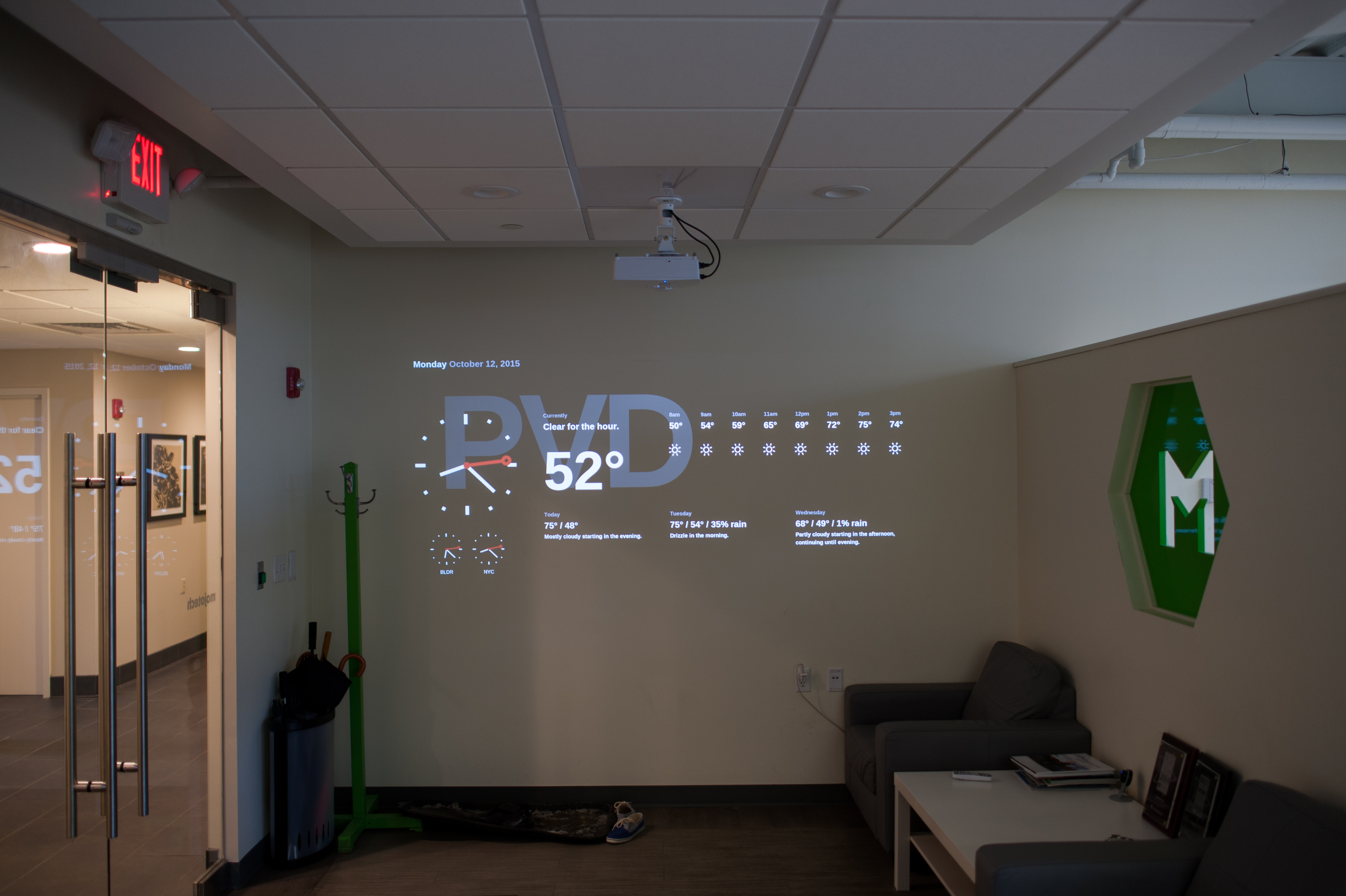
After sharing the project with a couple of my fellow Mojos, I got a lot of great ideas for how we could put it to use in the office. A few days later, we put up a projector by the front door and started iterating.
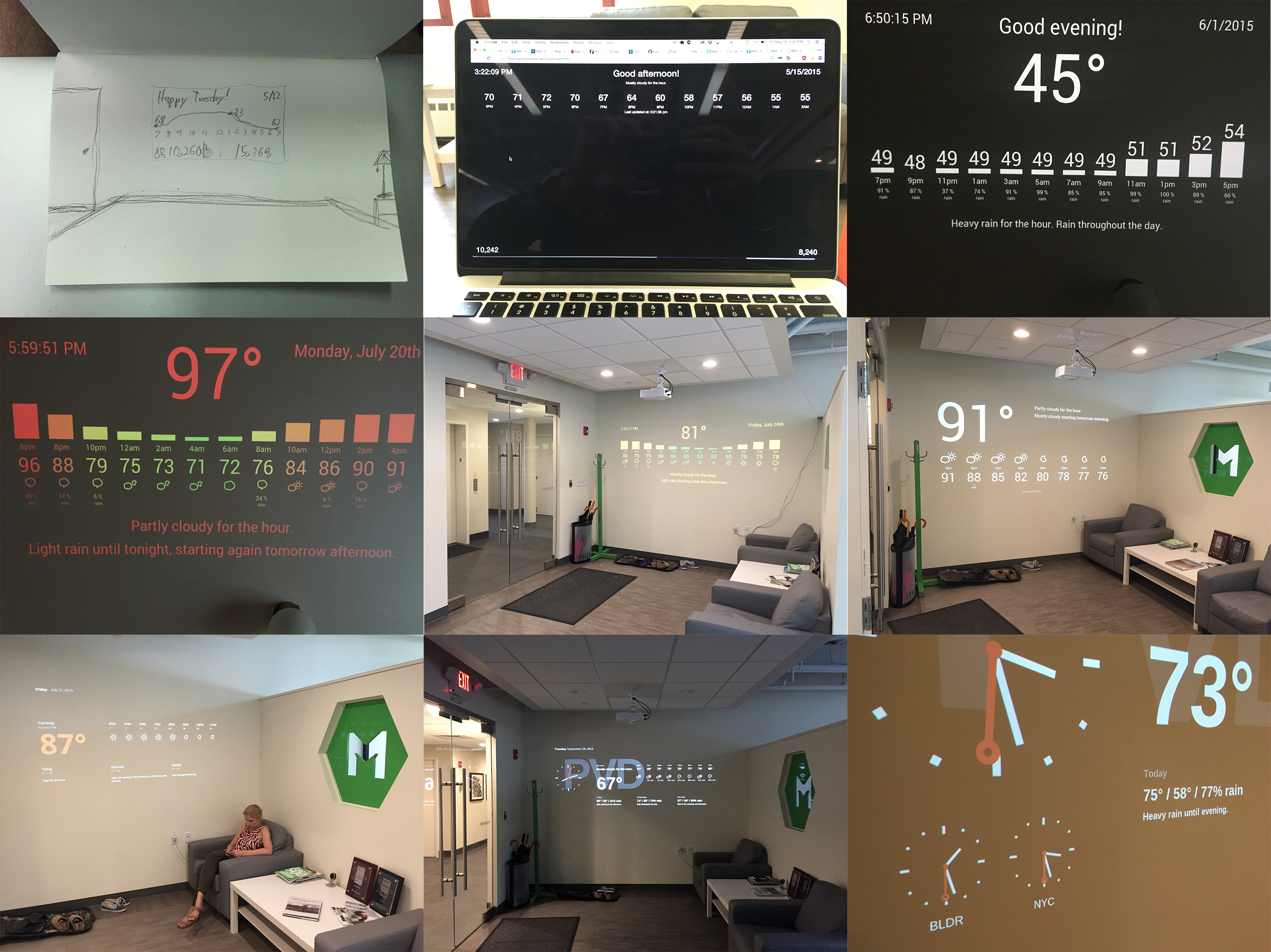
Evolution of an app
First, we clarified the design, making the temperature more dominant and limiting the forecast to the next eight hours, and removed the colors to focus on a cleaner aesthetic.
In the next pass, we experimented with a new layout that included daily forecasts for the following three days and gave color-coded temperatures another try.
Next, we added a styled clock and watermark and ultimately decided that the colors weren’t a good fit.
Most recently, we added two smaller clocks relating to our offices located in Boulder and New York City.
Behind the scenes, we added Slack integration and an API server written in Go, allowing us to control the application via chat room commands.
 First row: Initial design sketches, first React prototype, first ceiling projection.
Second row: Color coded temperatures, the first day installed at the front door, first design pass.
Third row: Second design pass, adding the watermark/clock, adding the secondary clocks.
One of my favorite parts of working at MojoTech is the camaraderie from experimenting and learning from my coworkers outside the constraints of our typical work, and pushing the boundaries of what we traditionally build for our clients. Now that’s magical.
