Accessible by default
Intro
Warning: This post includes some graphic details of traumatic events.
The following is an approximate transcript of my RailsConf 2023 talk, Accessible by Default.
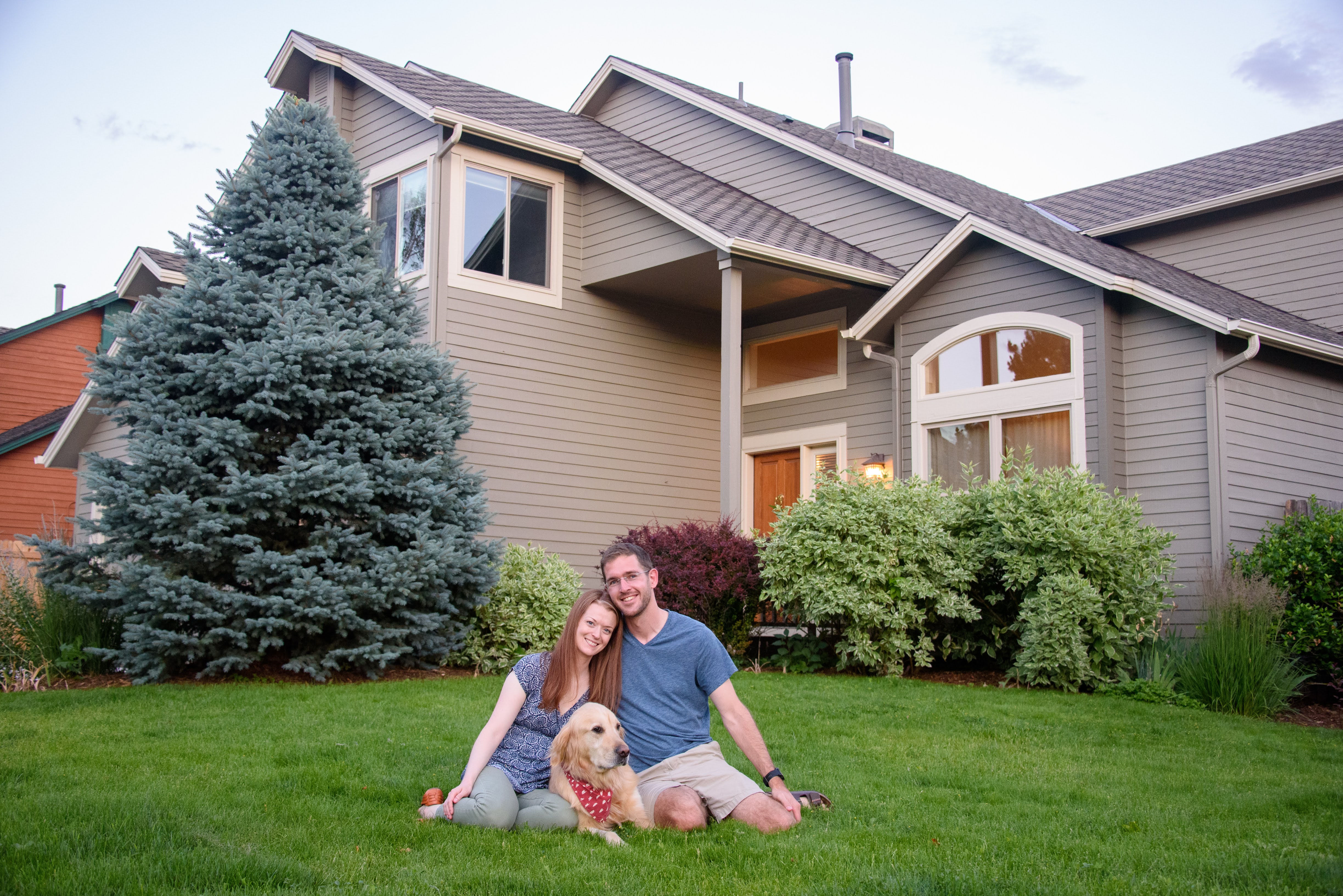
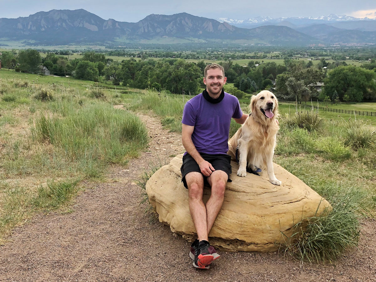
In the summer of 2020, my wife, dog and I had moved into the home we hoped to raise a family in. Like many of us in the industry, I lived a comfortable life. A life of privilege. We had little to worry about.
That all changed about a year and half later, at the very end of 2021.

We were on a road trip to San Diego for Christmas, enjoying some time away from home.
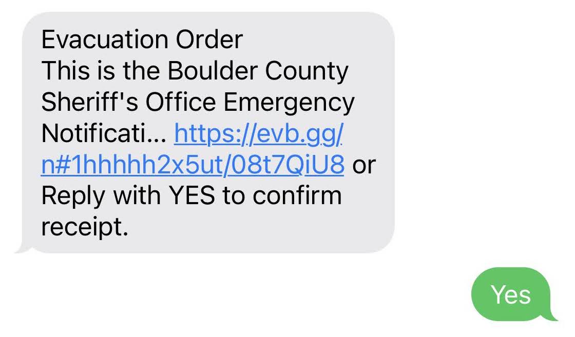
On the first day of our drive home, I got a text message to evacuate our home in Louisville. It was a little bit before 3pm.
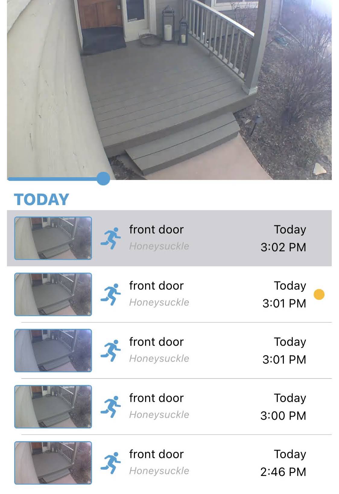
Soon after, falling ash triggered our front door security camera, triggering motion alerts every minute. I had to turn them off. I was regretting having backup power for my modem.
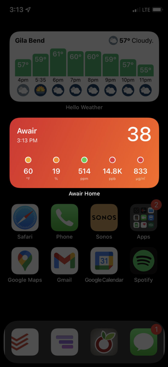
A few minutes later, I checked our home air quality monitor. Things weren’t looking good. This particular measurement, PM2.5, was approaching the worst levels ever observed in Beijing! And this was inside my house.

About an hour later, I came across this image on Twitter. The house on fire was about 100 yards from ours, up wind.
But we never did see any images from inside our neighborhood.
It wasn’t until the following morning that I checked twitter and saw a drone video of our neighborhood.
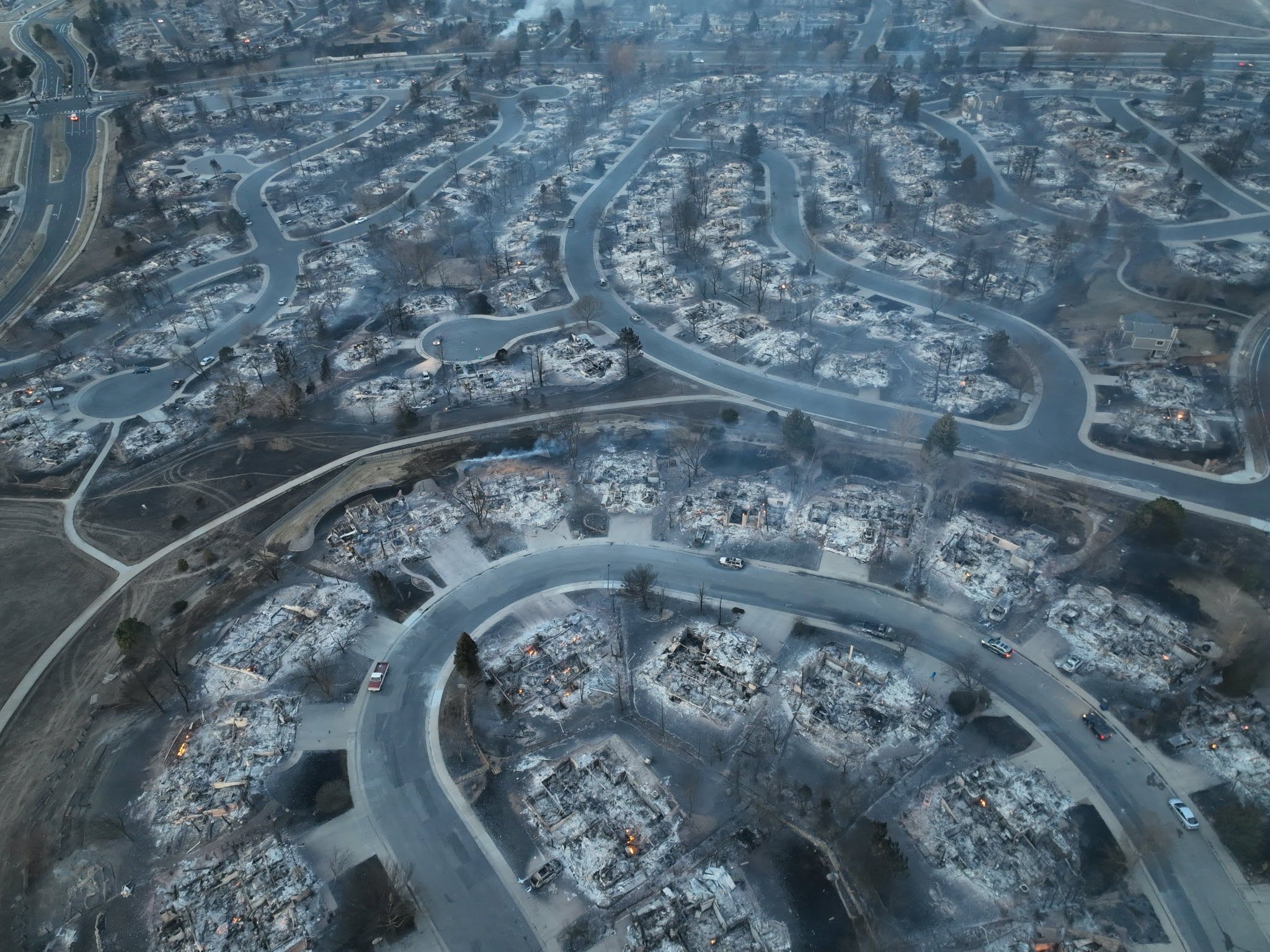
Over a hundred homes in our neighborhood burned to the ground, including ours.
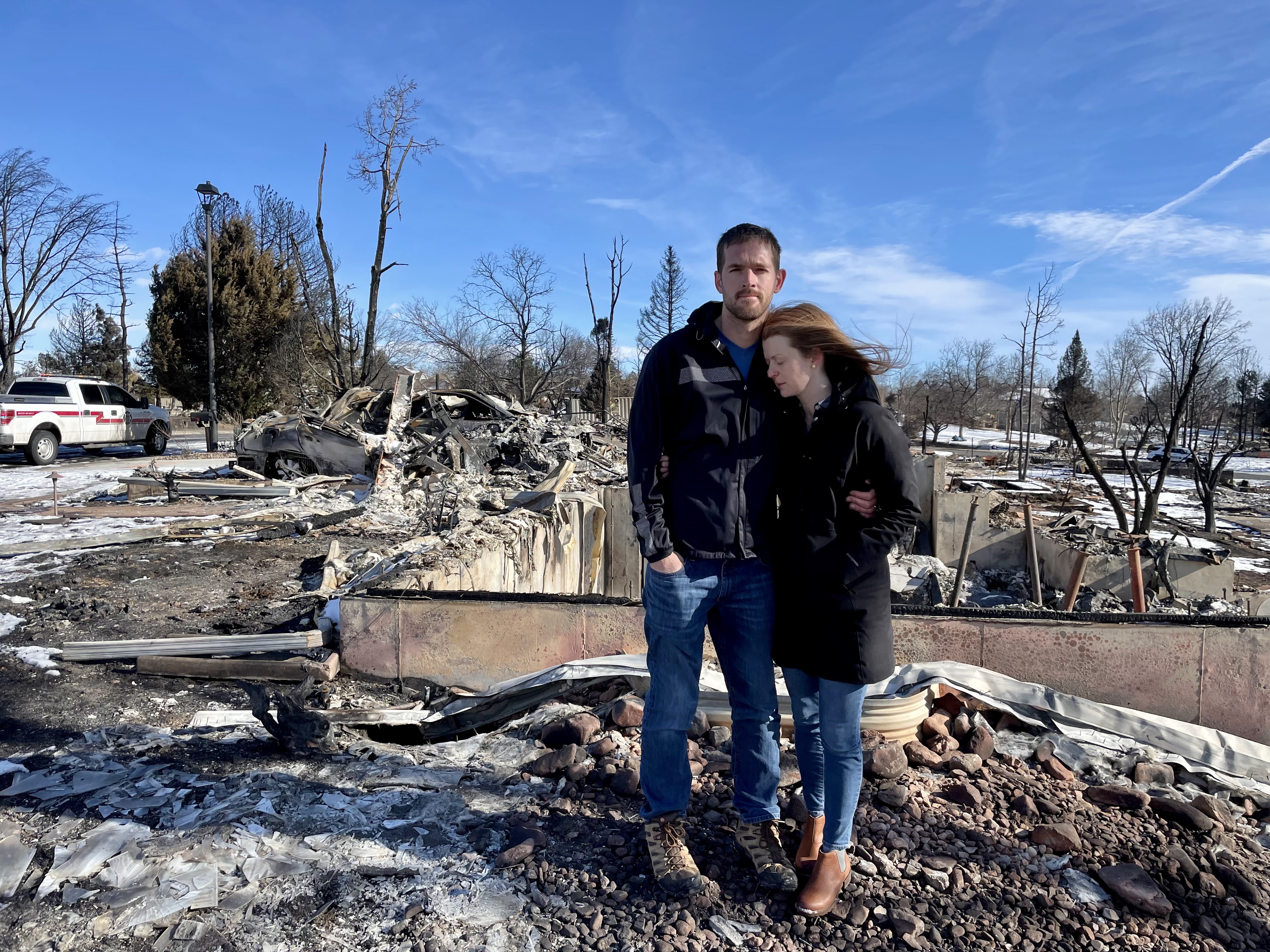
It was a few days before we were able to see it for ourselves.
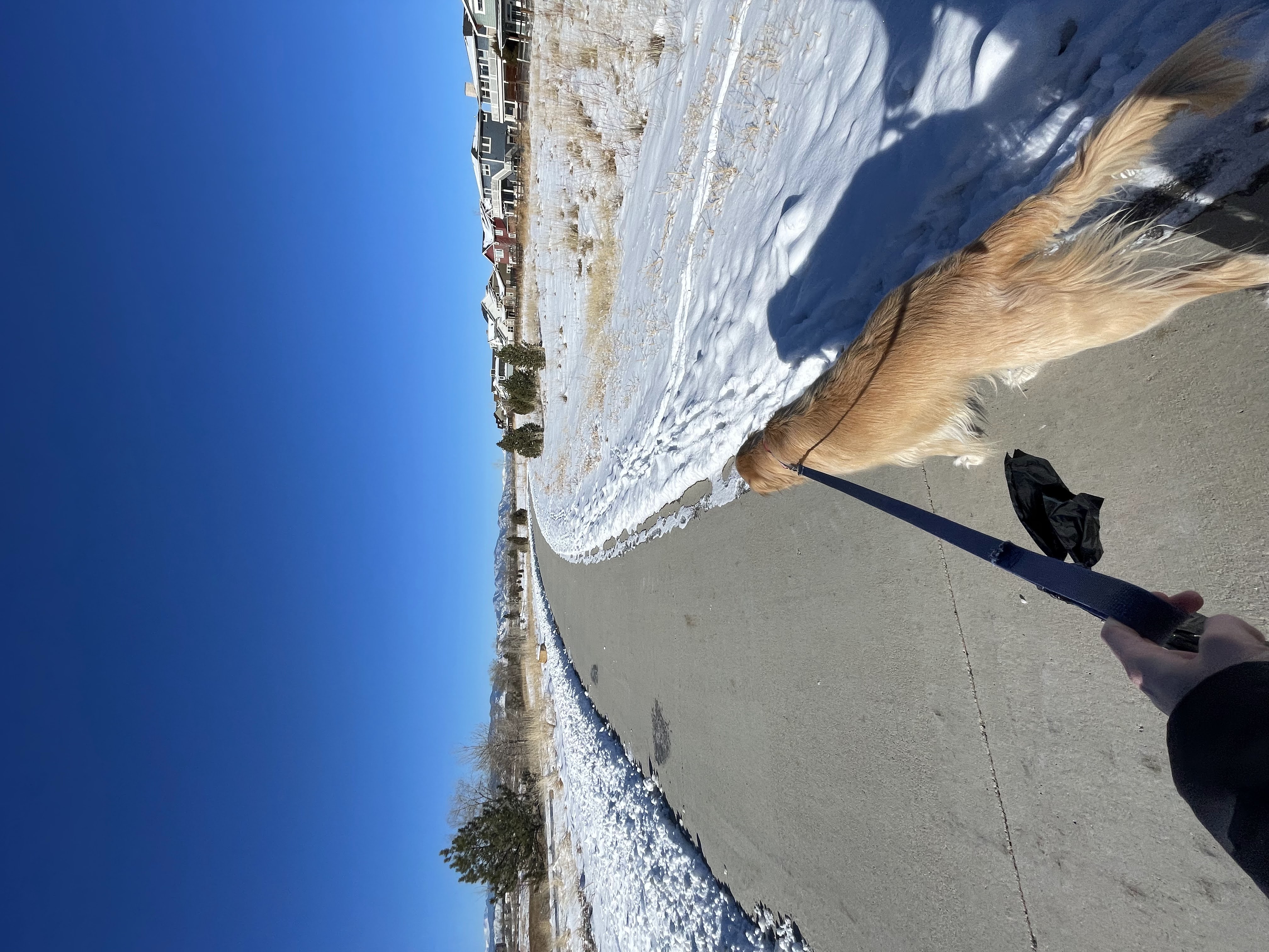
One memory that sticks out to me is realizing two weeks later that I hadn’t walked Captain since the fire. I literally hadn’t even thought to do something that I used to do three or four times a day before.
I noticed other things too. It was harder for me to focus. I got angry easily. I remember struggling to use my password manager on my phone. Things that were easy for me to do before were difficult if not impossible. I remember even having a hard time solving CAPTCHAs.
What I soon learned from a counselor at the Red Cross was that emotional trauma can cause brain damage. In my case, both temporarily and permanently.
This experience has opened my eyes to the privilege I experienced before the fire. It changed the way I view the world and the work we do in the industry.
So that’s what I’m going to talk about today: accessibility. It has many definitions in this context, but I like the one from interaction-design.org:
Accessibility is the concept of whether a product or service can be used by everyone—however they encounter it
In the past, I imagined that disabled people were mostly just those using wheelchairs or blind people using canes. I’ve since learned how disabilities come in many different forms.
One framework for describing disabilities is situational, temporary, and permanent.
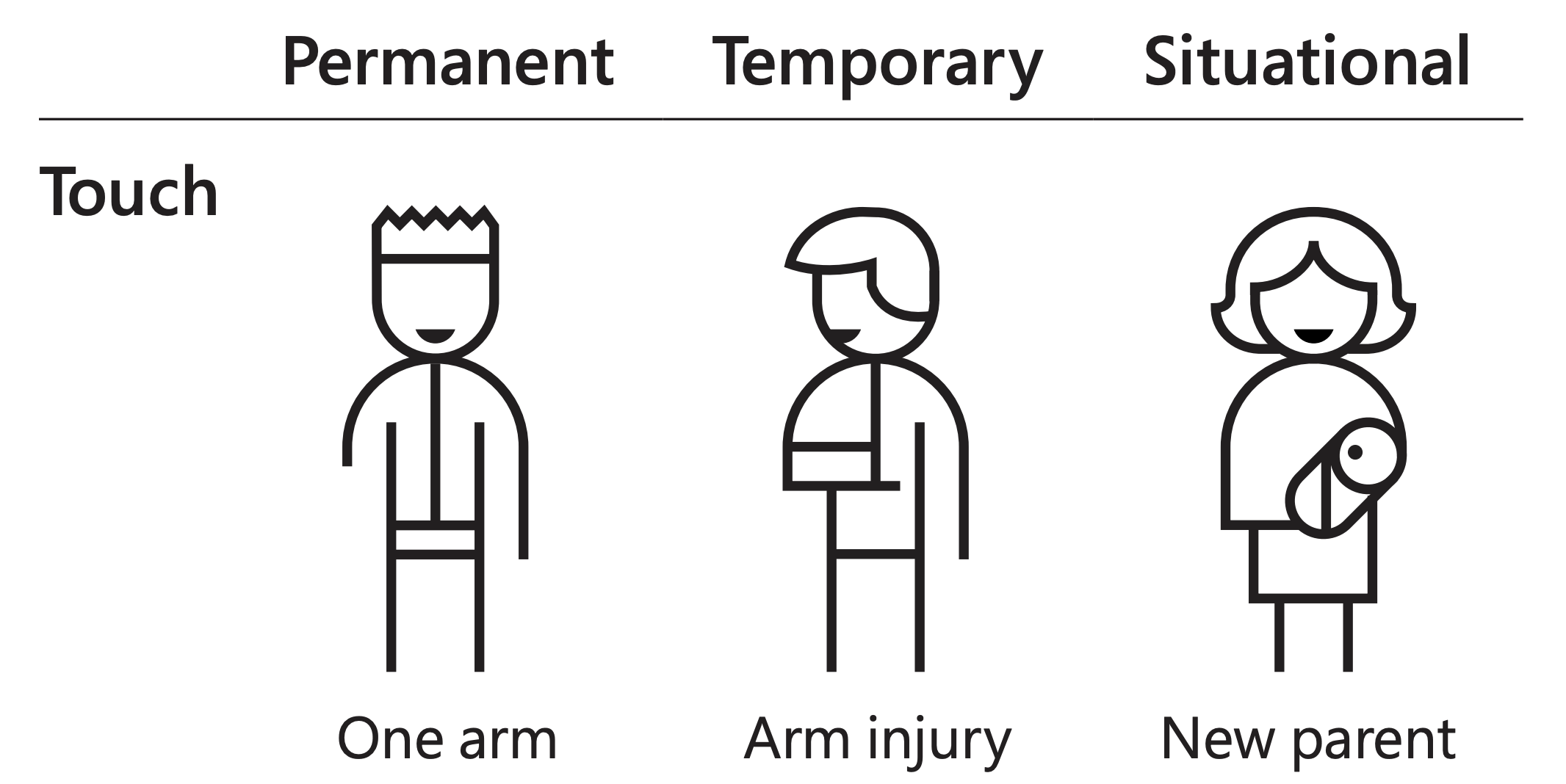
For example, a permanent touch disability would be having one arm, a temporary touch disability could be having a broken arm, and a situational touch disability could be holding a baby (or carrying a box of pizzas into a meetup!).
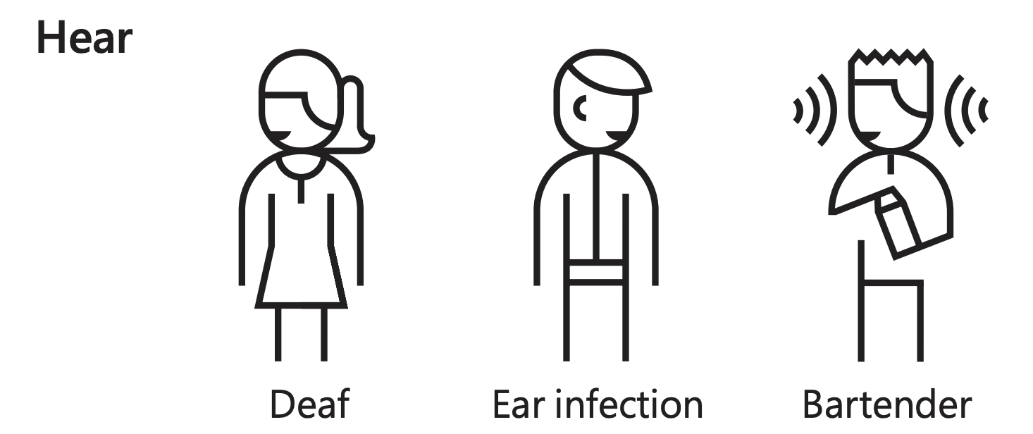
A permanent hearing disability is deafness, temporary might be an ear infection, and situational working in a loud environment.
I was temporarily disabled when I couldn’t complete CAPTCHAs due to being panicked in the trauma of the fire.
There are various guidelines and standards for accessibility, such as WCAG, Section 508, APG, and others. Not all of them agree with each other!
In practice, for the work we do, accessibility means making our applications work with assistive technology. While I won’t go into much detail here, we mainly focus on screen readers, tools that read the screen out loud via keyboard control.
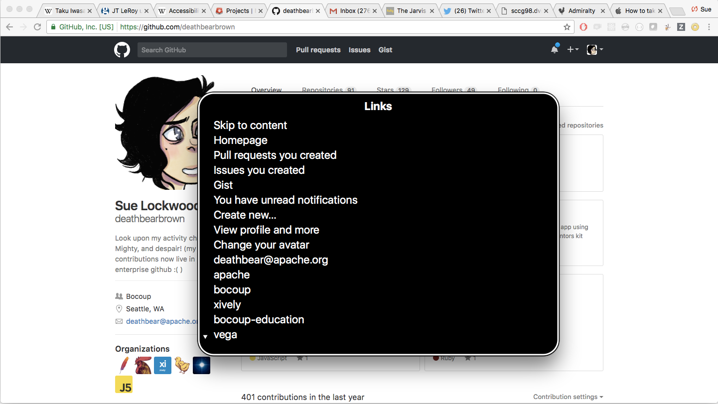
For example, when reading this GitHub profile page, voiceover announces each section of the page as the user navigates with their keyboard.
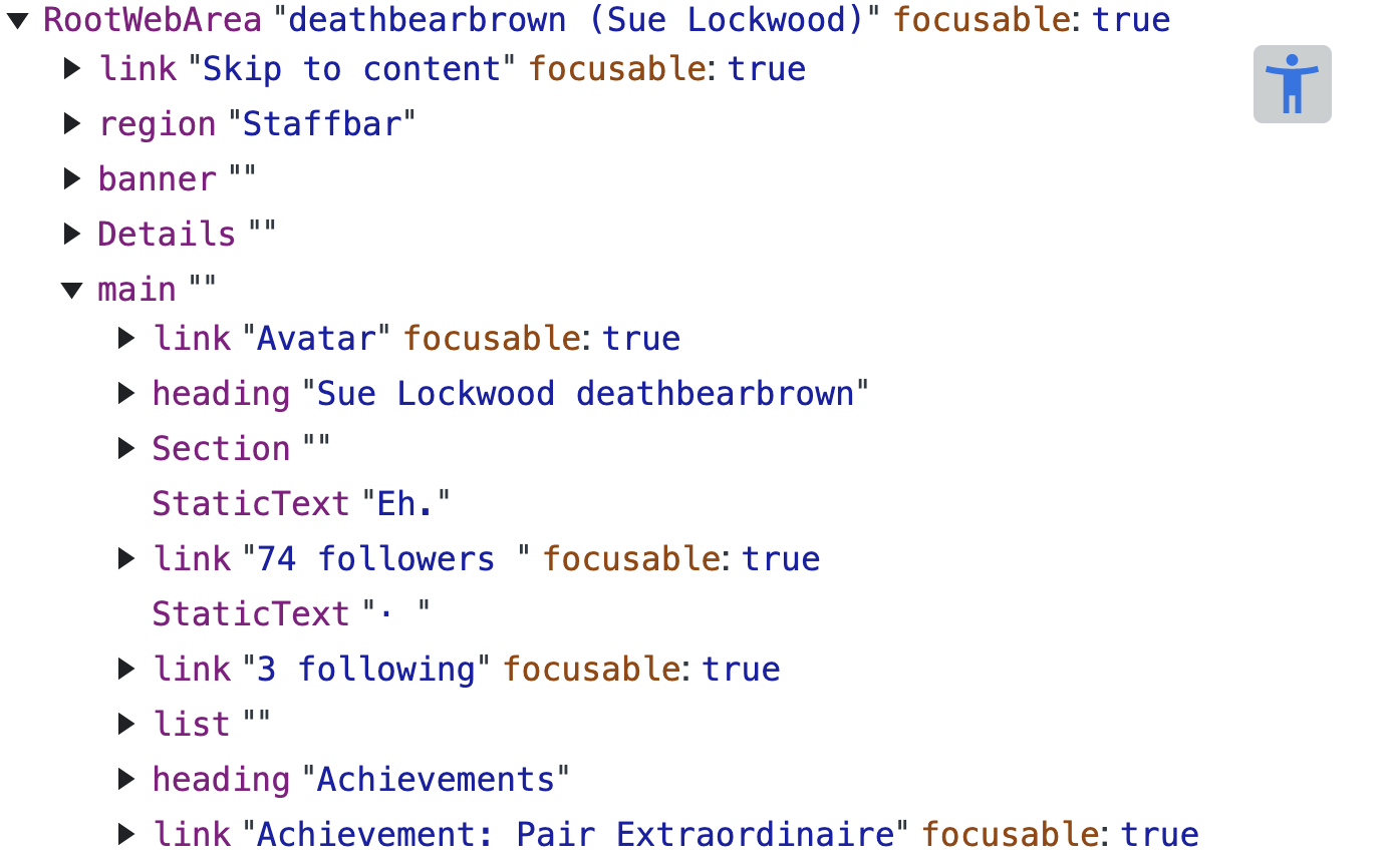
Effectively, screen readers turn web pages into a tree structure that is navigated by keyboard. You can actually view this tree structure in Chrome dev tools under Accessibility.
Today, I’m going to share how we’re taking this approach to improve the experience of using GitHub for users of assistive technology like screen readers, using automated scanning, preview driven development, and a custom form builder.
Who am I?
I’m a staff engineer at GitHub. I work on various company-wide UI-related initiatives. I continue to lead the ViewComponent project.
When I share details of what it’s like to work at GitHub, I like to start by giving a rough idea of the scale of our company.
As of December, we have about 4,000 employees. GitHub continues to primarily be built as a monolithic Ruby on Rails application, at least when it comes to serving customer-facing traffic. There are about 1,400 controllers in our codebase.
I love mentioning this stat every year I give a talk, as it really shows how much we continue to grow our monolith. We’ve added about 350 controllers in the past year! This is to a code base that is 15 years old and millions of lines of Ruby.
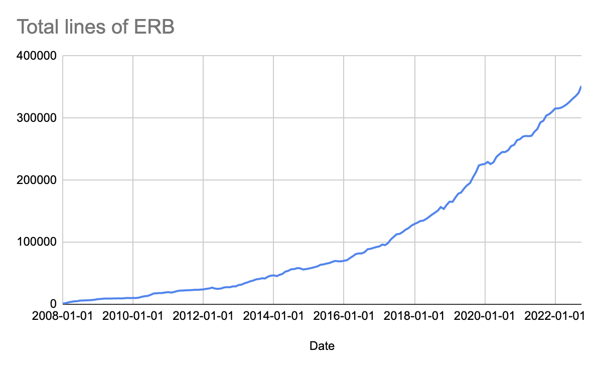
I love this graph of our lines of ERB over time since our first commit. That is quite a curve!
I think it’s important to share this kind of context as it can frame why we make the decisions that we do.
GitHub history 101
To understand how accessibility works at GitHub, I think it’s important to start with a little history, mainly because GitHub is a weird company.
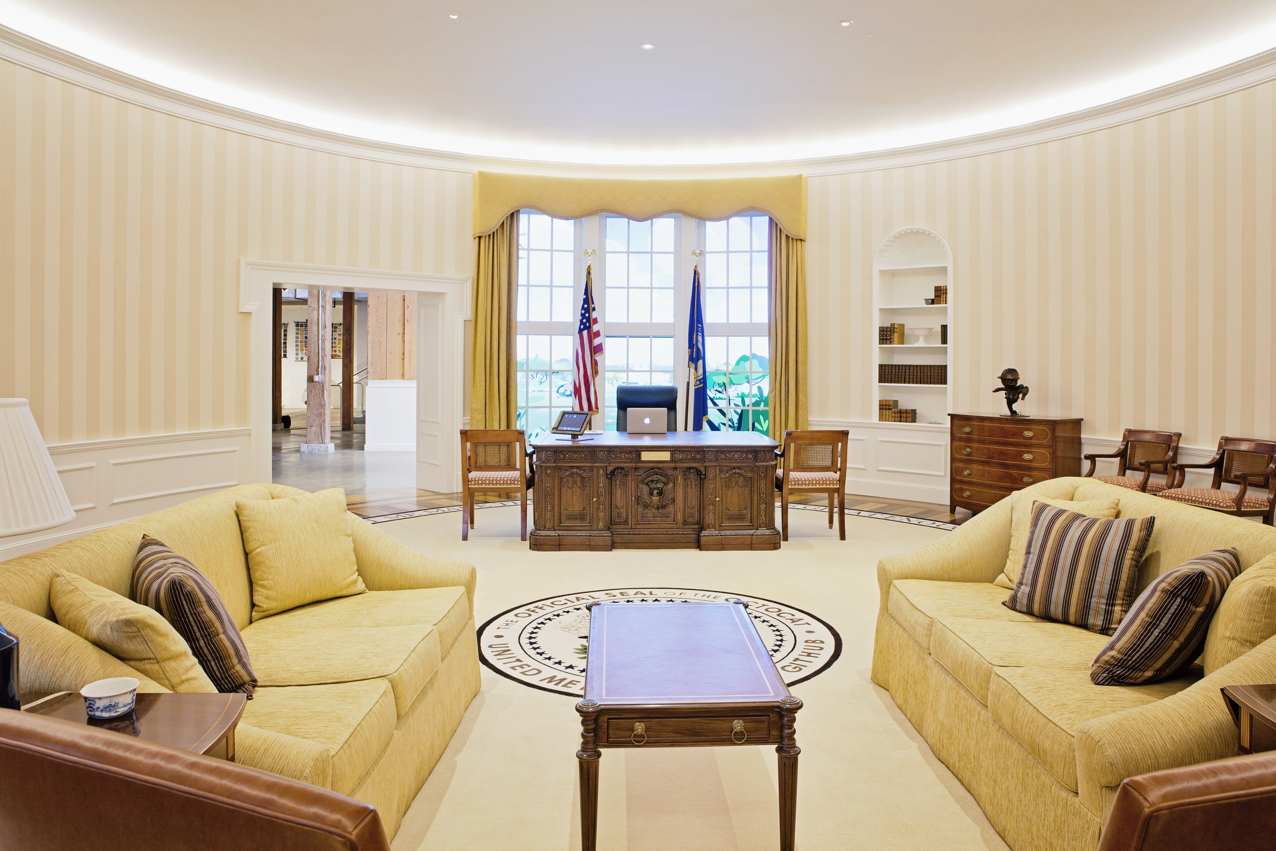
For the first six years GitHub was a company, there were no managers. Visitors to our San Francisco headquarters were greeted in a replica of the oval office from the white house.

On the floor was a rug that read “the united meritocracy of GitHub.”
For years, we operated in what some folks have called a “cooking for chefs” mindset. Since we were developers ourselves, we knew what we’d want GitHub to be like. That meant we could build whatever sounded good to us and reasonably expect our customers to agree. I don’t think the manager-less organization structure would have worked for as long as it did if this wasn’t the case.
But this approach had its downsides. I know of cases where we more or less ignored customer requests because we couldn’t find a team to work on them, even if they were losing us large sales.
Thankfully, a lot has changed since then.
GitHub’s accessibility goals
Today, one of our tenets is that we are the “home for all developers.” When it comes to accessibility, our goal is pretty simple: Full and equal participation of people with disabilities in the development process. We believe that access to technology is a fundamental human right. That everyone deserves to have the opportunity to create, innovate, and collaborate while contributing to our digital future.
These are big goals! Especially for a surface area of thousands of unique user-facing pages.
Because of this scale and how quickly our products are growing, manually checking and fixing each page for accessibility issues is basically impossible. Even if we went that route, pages would likely regress quickly.
Tooling
To achieve our goals, we need good tools. Here are a couple we use for accessibility: Axe, Previews, and our Forms Framework.
Automated scanning
If you take nothing else away from this talk, it should be that bad accessibility rarely breaks CI. Very rarely do any of our standard practices lead to accessible experiences.
Even when we do have automated accessibility checks, they are far from perfect. Depending on who you ask, between 30 and 50 percent of accessibility issues can be caught with automation.
For example, we can automatically check that images have alternative text for screen readers to consume, but we can’t check that the alternative text actually describes the image correctly.
There are more subtle issues too. Designers use gestalt techniques such as proximity (such as grouping items into two columns) to convey meaning, information that isn’t consumable for people that are visually impaired.
That all being said, automated scanning can be pretty useful.
Our primary tool is Axe, an automated accessibility scanner.
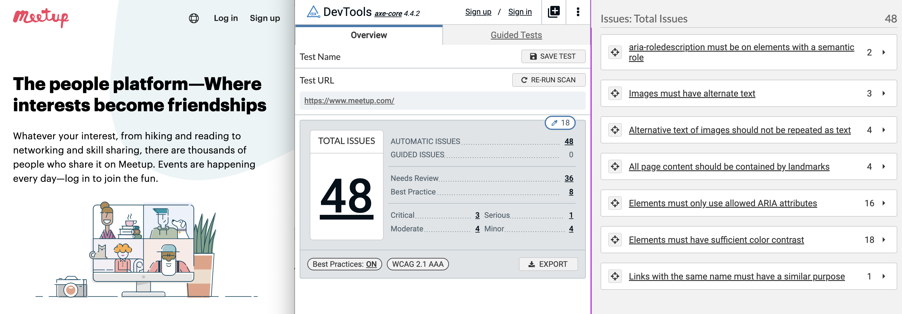
Axe can be run in a couple of different ways. As a browser plugin, you can view violations in the Chrome Devtools.
But the most effective thing I think we’ve done is to just turn it on for staff. We turn on axe by default in our local development environment, highlighting issues in red on the page and logging them in the console.
We also run it in production for GitHub staff members who opt-in with a user setting.
We use it in our end-to-end browser test suite that runs against every production deploy.
We also write custom Axe rules, such as enforcing that our tooltips that appear on hover only contain text, as they are especially inaccessible if they contain links.
Intractability
In some cases, we’ve run into UI patterns that simply weren’t accessible in any way, sometimes to the point of needing to have an entire page or even an entire workflow redesigned from scratch. Other things like drag and drop are especially difficult.
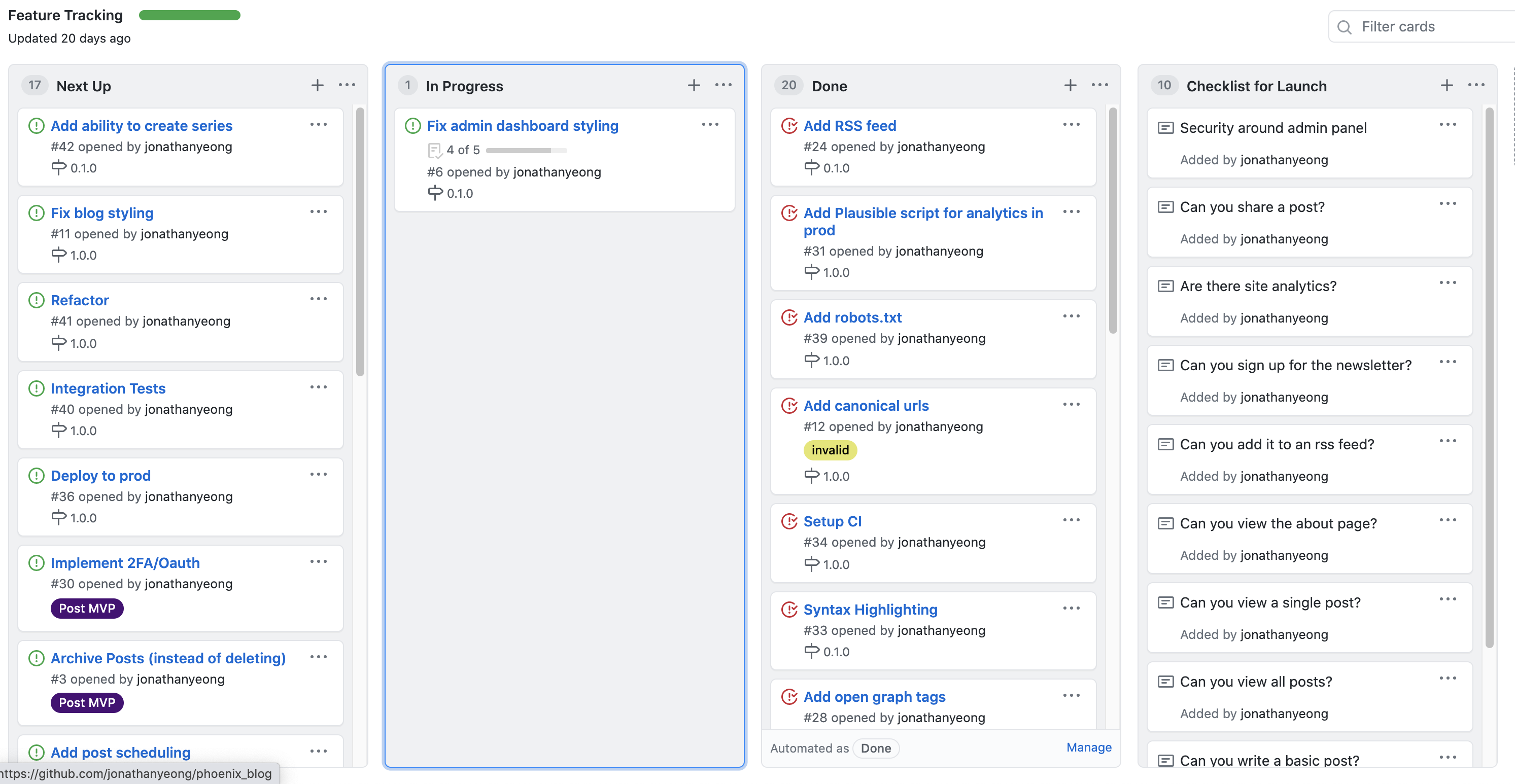
Can you think of how you’d move sort a card in this UI with just your keyboard? How about move it to another column? It actually is possible to make this UI accessible, but automated scanning won’t be able to tell you how.
Despite all of those downsides, Axe is a great starting point. Making your app axe clean will make it more accessible. We generally start with making a page Axe clean before doing more labor-intensive work, but that might be a good talk for next year!
Forms Framework
Another critical tool in our accessibility work has been our custom-built forms framework.
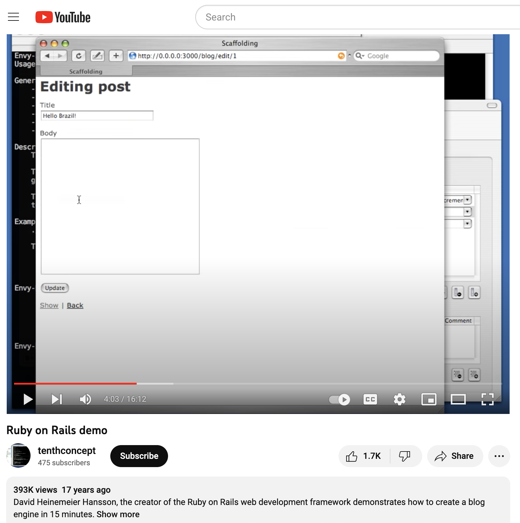
Forms are a core competency of Rails. If we go back to the original “build a blog in 15 minutes” demo from DHH, most of the demo is form building!
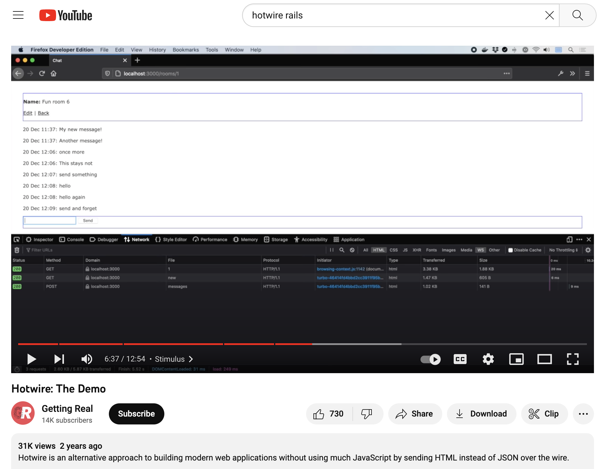
And that’s still true! 15 TODO some-odd years later, the hotwire demo is also mostly form building. Obviously this is something that Rails should be excellent at. (Hotwire/Turbo isn’t without its own accessiblity issues, either)
And it is! Rails has excellent built-in forms helpers: form_tag, form_for, and form_with (which combines the first two).
Here is an example straight from the Action View Form Helpers guides:
<%= form_with url: "/search", method: :get do |form| %>
  <%= form.label :query, "Search for:" %>
  <%= form.text_field :query %>
  <%= form.submit "Search" %>
<% end %>
<form action="/search" method="get" accept-charset="UTF-8">
  <label for="query">Search for:</label>
  <input id="query" name="query" type="text" />
  <input name="commit" type="submit" value="Search" data-disable-with="Search" />
</form>
What this example makes painfully obvious is that form_with more or less maps 1:1 with the resulting DOM. It’s essentially a DSL for HTML nodes. This is great! It simplifies a lot of complexity with building forms correctly and gives us a lot of syntactic sugar for things like building lists of select options.
But it isn’t accessible out of the box.
Looking at the example code, you can see that the form input has an associated label:
<label for="query">Search for:</label>
<input id="query" name="query" type="text" />
This was generated by two separate method calls:
<%= form.label :query, "Search for:" %>
<%= form.text_field :query %>
This example is great because it is accessible! Specifically, passes Axe rule 4.4, Form input elements must have labels, which reads:
Programmatically associate labels with all form controls. The recommended method for most circumstances is to use the label element and an explicit association using the for and id attributes. […]
Our example code does this correctly, but there’s a problem: it’s easy not to do this. As the Axe rule states, all of our form controls need labels. Yet Rails at best gives us an option to provide them.
One of my favorite engineering books is A Philosophy of Software Design. While working on the problem of accessible forms I was reminded of chapter 10, which is titled “Define Errors Out of Existence.”
The premise is in the title: we should construct our software to make invalid states impossible!
About a year ago we realized that we needed to do this for how we build forms. Luckily for me, we had just hired a new engineer on our team who was eager for a fun problem to solve, so I asked him: what would it look like to make our Rails forms accessible by default?
And that’s where our forms framework was born. Cameron set off to architect a form builder that avoided common accessibility bugs.
For example, we’d take our previous example:
<%= form_with url: "/search", method: :get do |form| %>
  <%= form.label :query, "Search for:" %>
  <%= form.text_field :query %>
  <%= form.submit "Search" %>
<% end %>
And rewrite it in our new DSL:
class SearchForm < ApplicationForm
  form do |search_form|
    search_form.text_field(
      name: :query,
      label: "Search for:",
    )

    sign_up_form.submit(label: "Search")
  end
end
What’s most important to highlight here is that there is now a single method to create a text field with a label, not two. Under the hood, we generate both the input and label tags, linking them correctly so that Axe 4.4 is satisfied.
In effect, we’ve just made that Axe error difficult if not impossible to violate. While it’s likely not possible to automate our way out of every possible accessibility violation, it’s nice to have a few less issues to worry about.
Accessible Abstractions
What’s been most enlightening about our experience has been that focusing on accessibility has helped us decide which components to build.
For example, in our design system we have an Avatar component. Often, it links to a user’s profile page.
However, we tend to use the avatar component next to a text link to the user’s profile. Sometimes we’d use a hover card for one or both items.
This combination can result in the user’s name being read out loud multiple times in a row for a screen reader. It’s not ideal.
So in order to make this common pattern accessible, we made a new component called nameplate, containing both an avatar and a text link. We then made sure the combination was exactly as it should be for screen readers.
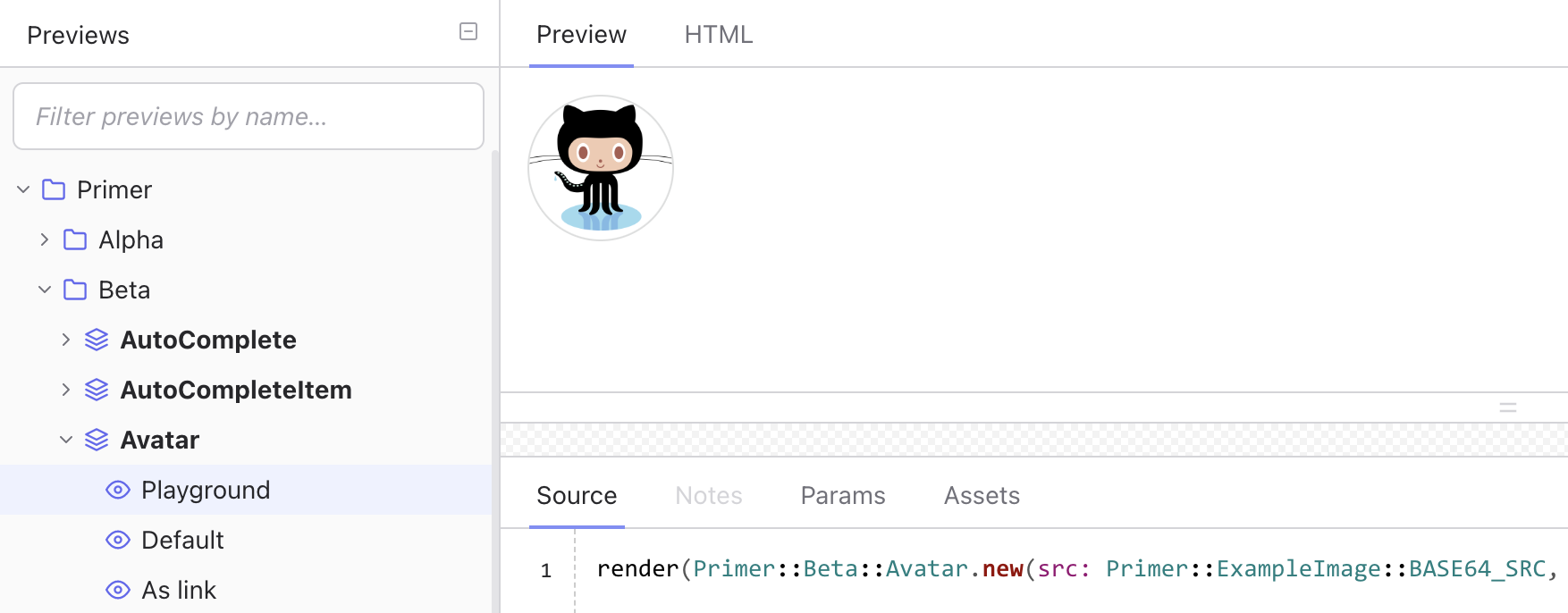
Previews
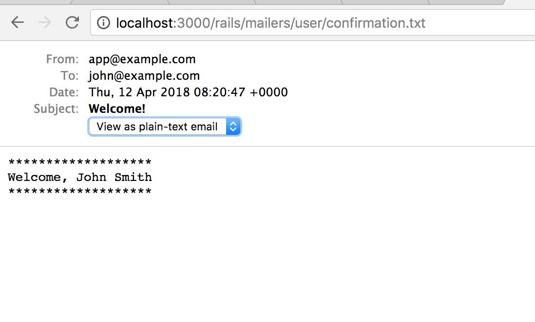
You might be familiar with using Rails ActionMailer Previews to develop and test HTML emails. It’s a nice, isolated development environment.
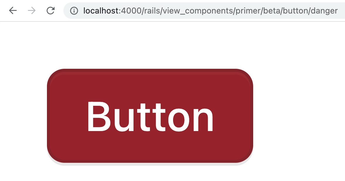
When we build our UI components, we write previews for them. A preview is an example of the component being rendered in isolation.
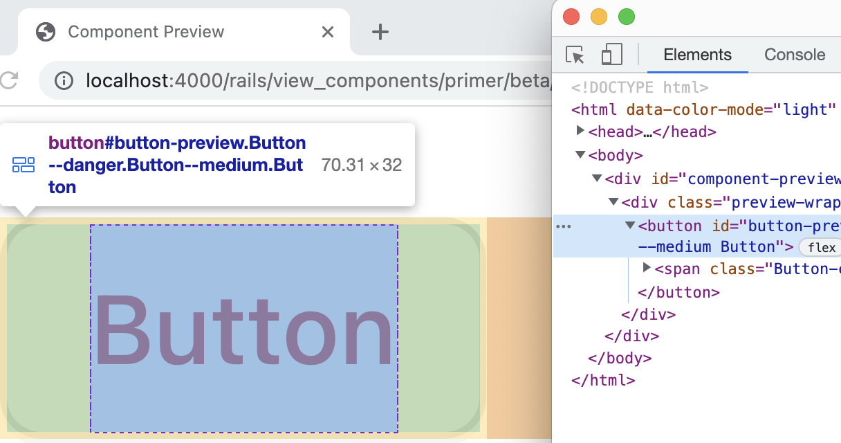
class ButtonPreview < ViewComponent::Preview
  def danger
    render(Primer::Beta::Button.new(scheme: :danger, size: :medium) do
      "Button"
    end
  end
end
In their simplest form, UI previews look a lot like mailer previews, which themselves resemble controllers.
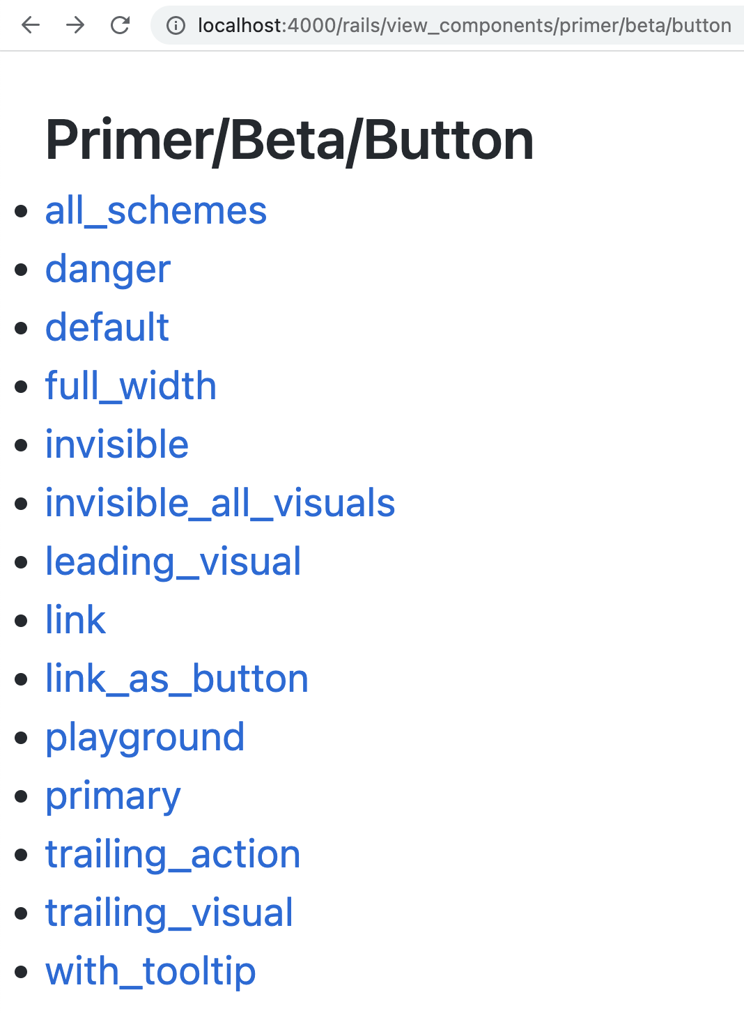
So for a button component, we might have a preview for each color scheme option.
class PrimerButtonComponentTest < Minitest::Test
  def test_renders_danger
    render_preview(:danger)

    assert_selector(".btn-danger")
  end
end
We also use these previews in our tests! Using the render_preview helper, we can render a preview inside our component unit tests. For a browser test, we call visit_preview instead!
What’s been fascinating about this workflow has been how much it has blurred the lines between our development and test environments.
I first came up with the idea for working this way when I realized that our test setup and seeds code had a lot of overlap.
module Primer
  module Alpha
    class NavListTest < Minitest::Test
      def test_sub_items
        render_preview(:default)

        # ...
      end

      def test_groups
        render_preview(:groups)

        # ...
      end
    end
  end
end
What we’ve ended up doing is consolidating our test cases into previews. We write a preview while designing our components, then use render_preview or visit_preview in our tests. This has a couple advantages:
It makes UI tests easier to understand, since you can often just look at the preview and see what is broken. If I misspell the selector in a test, it’s going to fail. Instead of trying to boot the test in a browser or dig through the rendered HTML, I can just navigate to the preview and inspect the state in Chrome.
It makes UI components discoverable. At our scale, it’s sometimes hard for one team to know what another is building. Sometimes the same thing gets built twice by multiple teams!
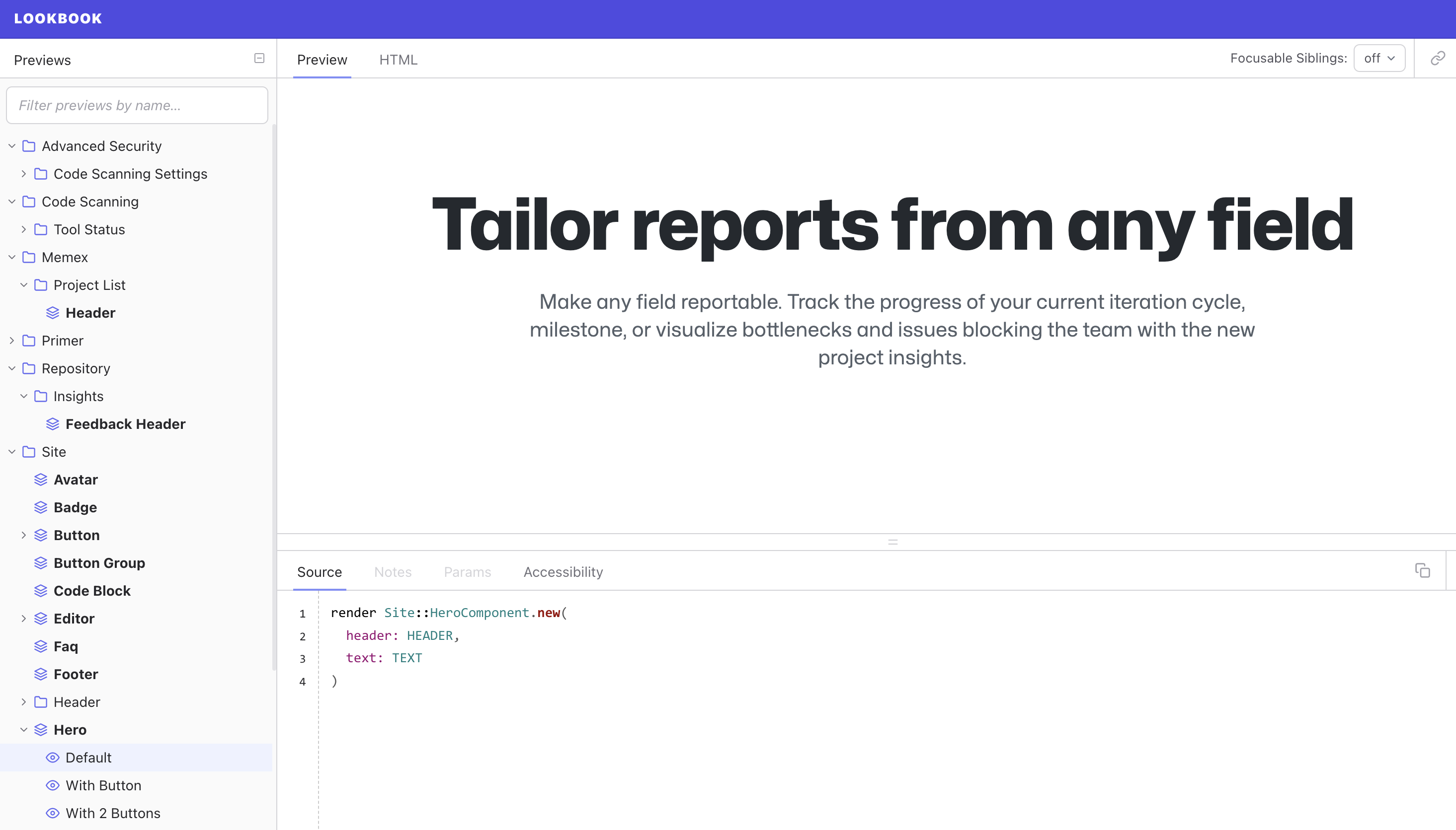
We use Lookbook to organize our previews into a component directory of sorts that can be browsed in local development. This tool is pretty similar to Storybook for React, but it’s built from the ground up for ViewComponents using Hotwire!
It also couples our tests to our examples. By reusing our test cases as our documentation, there is an incentive to write test cases that exercise our UI code in practical ways. It also ensures that our examples actually work! It was amazing to me the first time we converted our examples to previews and found that a significant fraction of them raised exceptions when rendered! In fact, we are quickly moving away from having documentation sites for components at all, instead leaning on Lookbook for all examples.
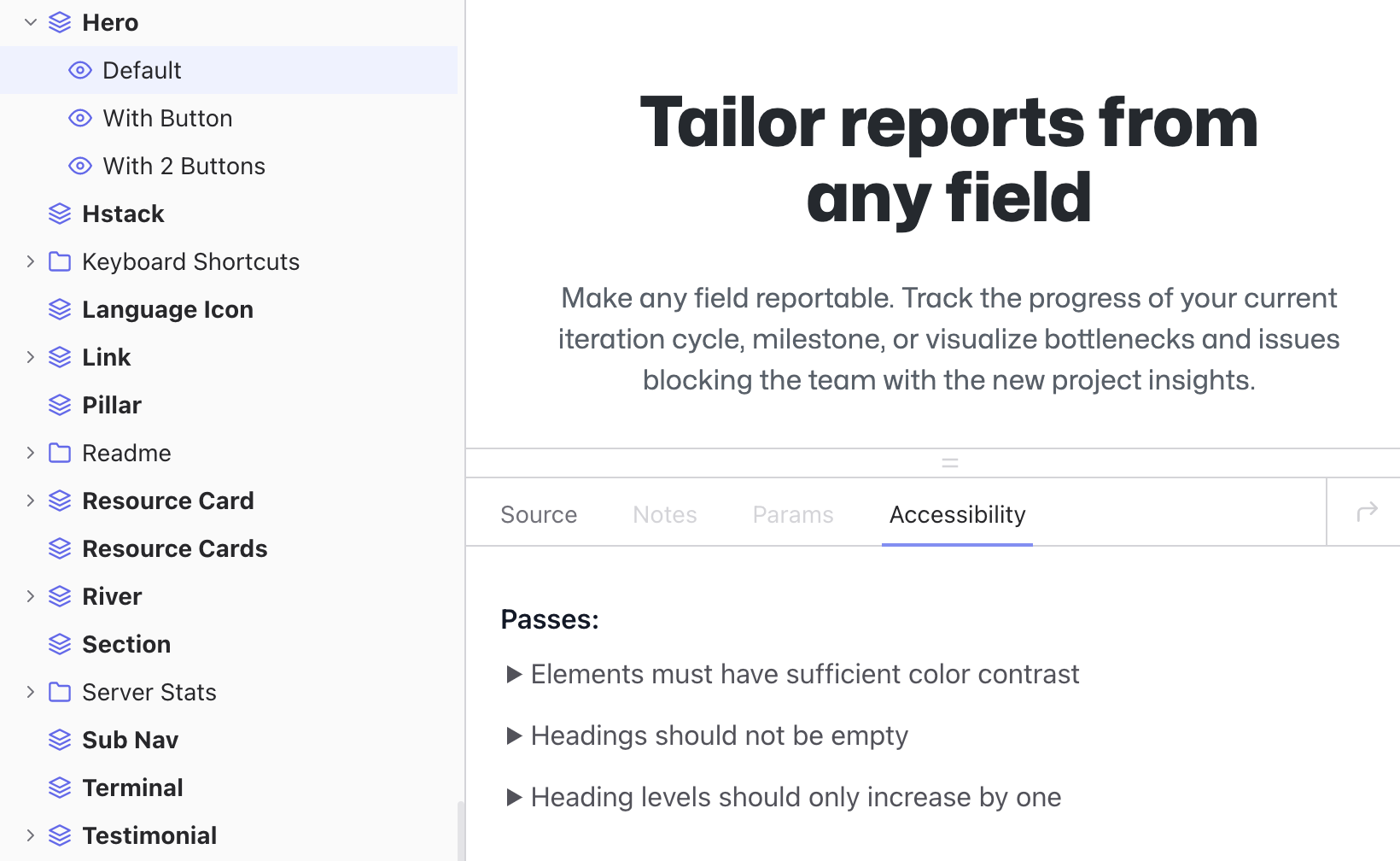
As we’ve added it to our Lookbook configuration!
Which means that we can build components in isolation with live accessibility feedback.
This is a great example of how the Rails ecosystem can benefit from adapting ideas from other languages and frameworks.
Conclusion
Universal design is the idea that we should build products, experiences and environments that work for all people regardless of age, ability, or other factors.
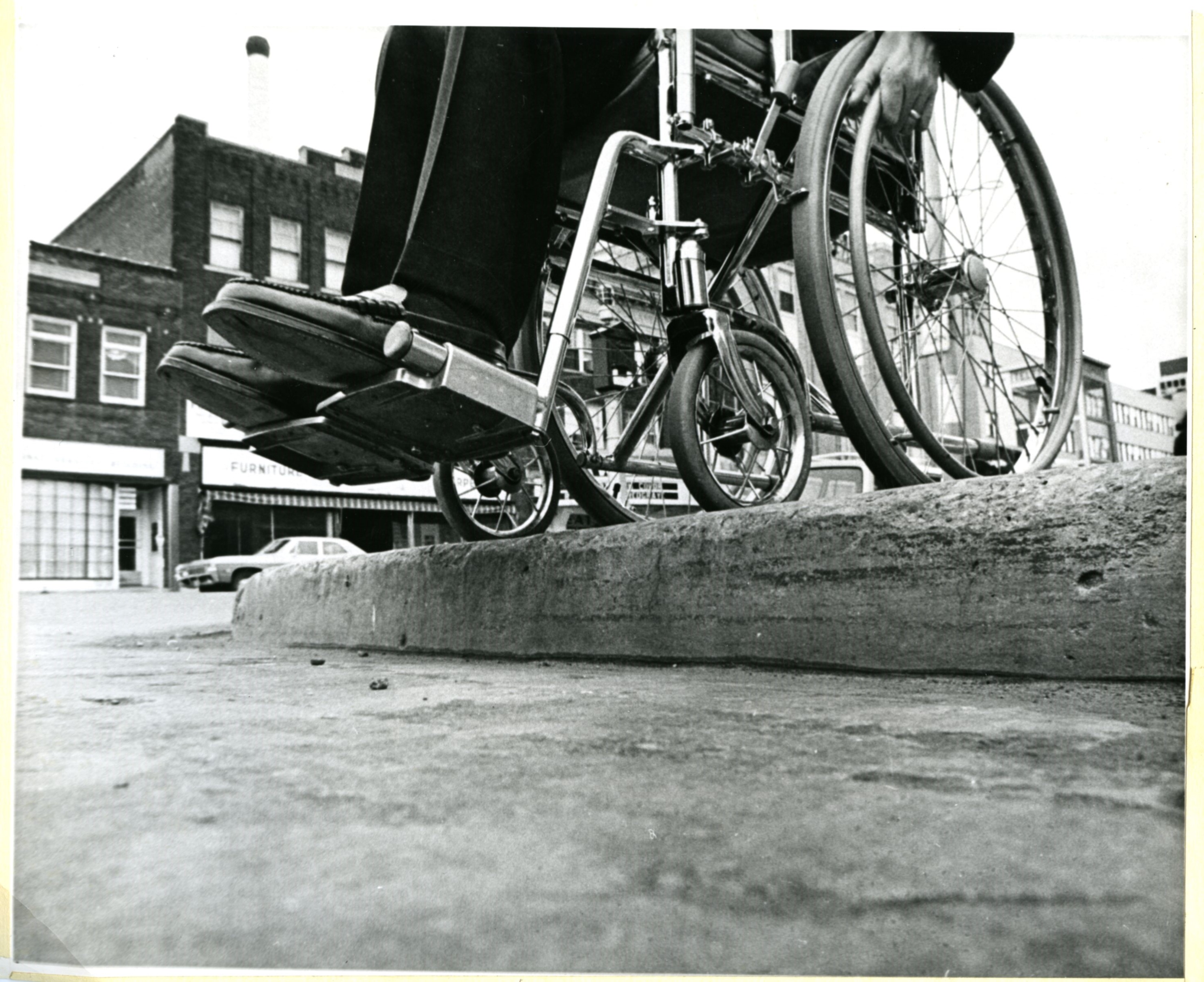
In the real world, a good example of this is curb cuts: while originally intended for wheelchair users, they also benefit stroller pushers and to be honest, those of us who would rather not lift our feet up so high!
In the software world, this might mean adding a SSO option to our app so that people with disabilities can avoid CAPTCHAs, which are notoriously inaccessible. I really loved SSO when I was in shock after the fire!
But perhaps the bigger lesson here is that accessibility is just an example of a larger class of blind spots we have as able, wealthy, first-world developers. This reminds me of one of my favorite quotes, from Donald Rumsfeld:
We also know there are known unknowns; that is to say we know there are some things we do not know. But there are also unknown unknowns—the ones we don’t know we don’t know. And if one looks throughout the history […] it is the latter category that tends to be the difficult ones.
Applying this way of thinking has opened my mind to other similar issues. Take browser performance for example: at GitHub, we are issued powerful Apple laptops and cell phones. They enable us to be about as productive as a computer could help us be.
But they give us a false sense of reality: even among our customer base that skews towards users of more powerful hardware, the experience we have using our products is not the same as our customers’.
This is even an issue with request latency! Most GitHub traffic is served from the US east coast, which means that our mostly US-based staff does not experience the lag time our customers in, say, Australia, do.
So how do we look out for these blind spots? How do you find unknown unknowns? We can embed empathy into our engineering practices.
By putting yourself in the shoes of others, the more different from yours the better.