How to make your application accessible (and keep it that way!)
The following is an approximate transcript of my RailsConf 2024 and Rocky Mountain Ruby 2024 talk, How to make your application accessible (and keep it that way!).
One of the things I love the most about the Ruby community is how caring and welcoming we are. While programmers are often stereotyped as out of touch, I’m so proud of how we’ve come to value inclusivity.
But I have bad news: as an industry, our products are incredibly unwelcoming to people with disabilities. Depending on who you ask, between 70% and 99% of the internet is effectively out of reach for people who are blind.
Yet I have good news: we can do better! I’m here to show you how. We’ve been working hard over the last couple of years to make GitHub more usable for people with disabilities and I’d love to share what we’ve learned so that you can do the same at your company.
Last year I shared how we embedded accessibility into our UI tooling. I gave examples of Axe scanning, a custom forms framework, and UI previewing tools like Lookbook. While the technical details were well received, I found the questions I received and the resulting discussion more interesting than what I prepared. The questions amounted to: “That’s nice, but how do you scale it?” As a Rails developer for the last decade, this is a question I’ve gotten pretty used to.
More specifically, the questions were: 1) How do you get leadership to care about accessibility? 2) How do you make an entire application accessible? 3) How do you keep it that way?
Before I get too far, how many of you have accessibility goals at your company? How many of you have worked on them personally? If you have goals, why do you have them?
Our goals
History
We’ve long worked to make GitHub accessible. Various UI teams across the years have made improvements in fits and starts. But it was never a widely coordinated effort: we didn’t have any specific goals for accessibility. Things started to change when we were acquired by Microsoft. Microsoft cares deeply about accessibility and it’s often a non-negotiable requirement of big enterprise and government sales contracts.
There are of course many non-technical and non-economic reasons to make our products accessible: it’s just the right thing to do. But today I’m going to focus on the pragmatic, if not capitalistic reasons, trusting that we can agree on the idealistic.
Legal risk
Accessibility is also a legal risk. While I am not a lawyer, this wouldn’t be a talk about accessibility without mentioning that not having an accessible application is a legal risk, and often a significant one. Many companies have faced legal pressure for accessibility issues, including GitHub.
Lawsuits have long been an effective tool in making buildings accessible to those with disabilities. For decades wheelchair users have sued businesses for not having ramps and tables they can use. The same is true for digital accessibility. According to Forbes, there were over twice as many digital accessibility lawsuits filed in 2023 as in 2018. During that time, nearly 80% of the top 500 e-commerce websites received a lawsuit.
Our target
Our most concrete goal for GitHub.com is to make our user experience work for people who use assistive technology. In practice, that means complying with WCAG 2.1 guidelines, an internationally recognized standard for accessibility used by companies and governments in purchasing decisions.
Scale
Whenever I share how we do things at GitHub, I think it’s important to provide context on the scale we are operating at. GitHub has approximately 4,000 employees, with around 1,700 engineers. GitHub remains a large monolithic Ruby on Rails application with a few dozen supporting services. Most application and API traffic is still routed through our monolith. We have around 2,000 unique pages. 95% of our routes are rendered with Rails views and ViewComponents. 5% are rendered with React. How big is your company? 10s, 100s, 1,000s, 10,000s of engineers? How many pages do you have?
Regardless of the size, I’m hoping to share what we’ve learned so that you can avoid the mistakes we’ve made scaling our accessibility work.
Overview
There are three key things we’ve learned we needed to be successful at accessibility: measurement, durable ownership, and lived experience.
Measurement
A few years ago, I joined the design organization at GitHub, reporting to Diana Mounter, who would soon become our Head of Design. I remember an early conversation with Diana about how I was frustrated with the level of technical debt in the GitHub.com codebase around our usage of our Primer design system. I remember her saying: “there will always be something to refactor, why does this refactor matter?” and “If we do it, how will we know when we’re done?”
Just figuring out the scale of the accessibility work we’ve needed to do has been a challenge. One of my favorite books on this topic is How to measure anything, which, to spare you the rather dry reading, argues that measurements are best when they are precise enough to help you tell whether you have met your goal or not. If “premature optimization is the root of all evil,” making a significant change without measurable success criteria is also the root of all evil!
When it comes to measurement, here’s what we found useful in practice:
To get an overall sense of our accessibility debt, we used the Axe automated accessibility scanner to count the number of accessibility violations on pages across our applications and websites.
An Axe-clean page is often a significant improvement over a page with Axe errors, as Axe can reliably ensure that basic accessibility accommodations are in place, such as alternative text for images. Deque claims that Axe can find 80% of a page’s accessibility violations on average.
We keep our DNS under source control, so I was able to easily get a list of the ~100 domains we have publicly accessible pages on. With that list, I wrote a script using playwright to run Axe and report the statistics to Datadog:
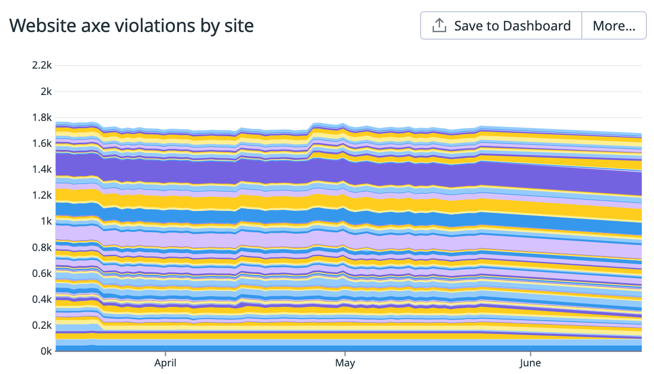
What this showed is that we had about 18 Axe violations per site homepage. While this is a third of the ~55 average number for home pages in broad surveys, it’s still a lot of potential problems for our customers using assistive technologies to navigate.
We used the same tooling to scan our design system, which led us to doing an Axe bug bash:
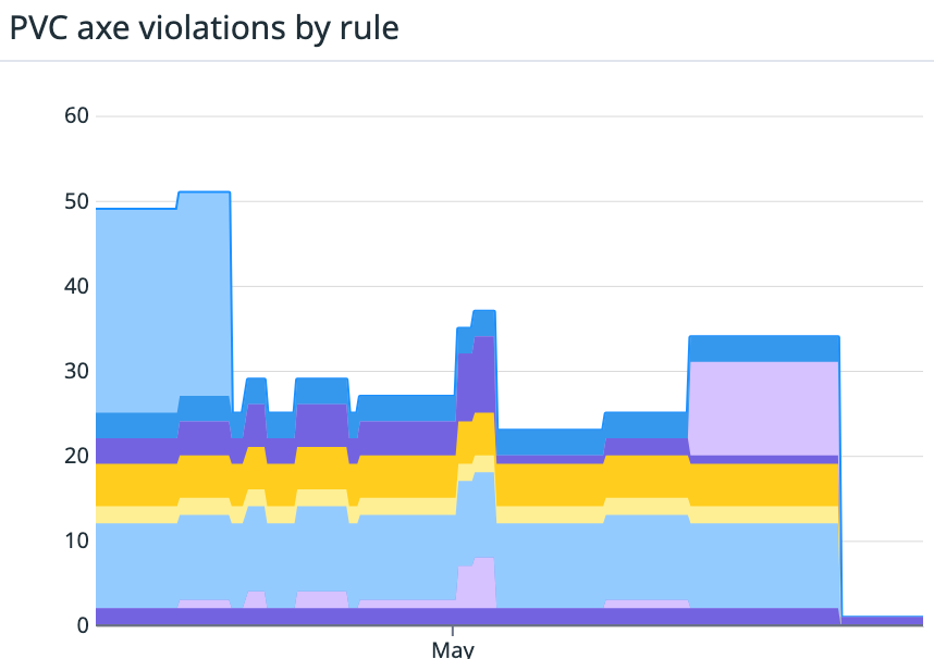
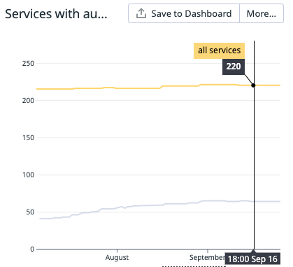
We also used it in system tests for our most critical UI paths in GitHub.com like creating a pull request. This graph shows the number of each Axe violation type for the same set of system tests over a quarter-long period:
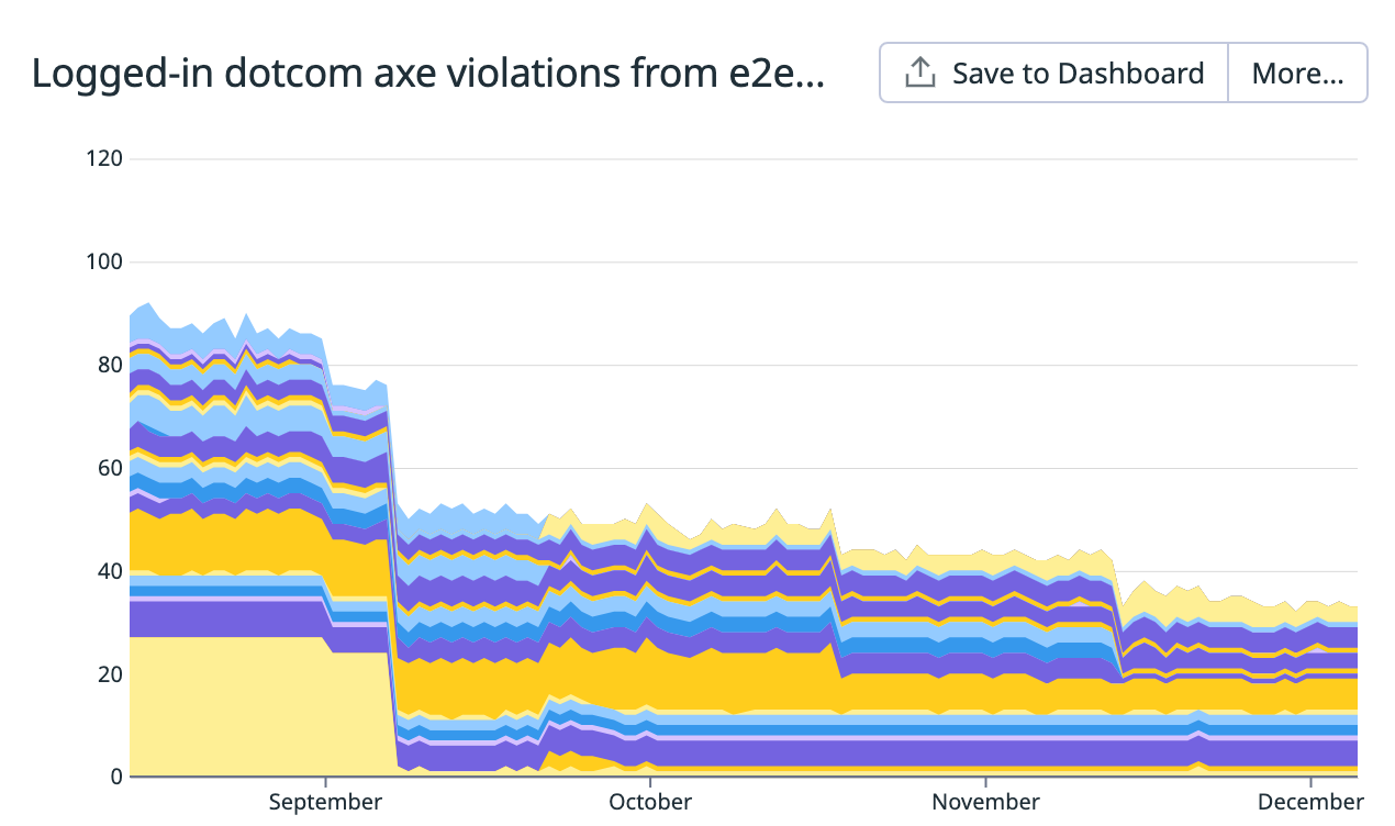
We also track longer-term trends for some of our most critical rules. My colleague Kate Higa charted a dozen of our accessibility linting violations over a four year period, showing how our focus on addressing Axe issues over the past year has had a drastic impact:
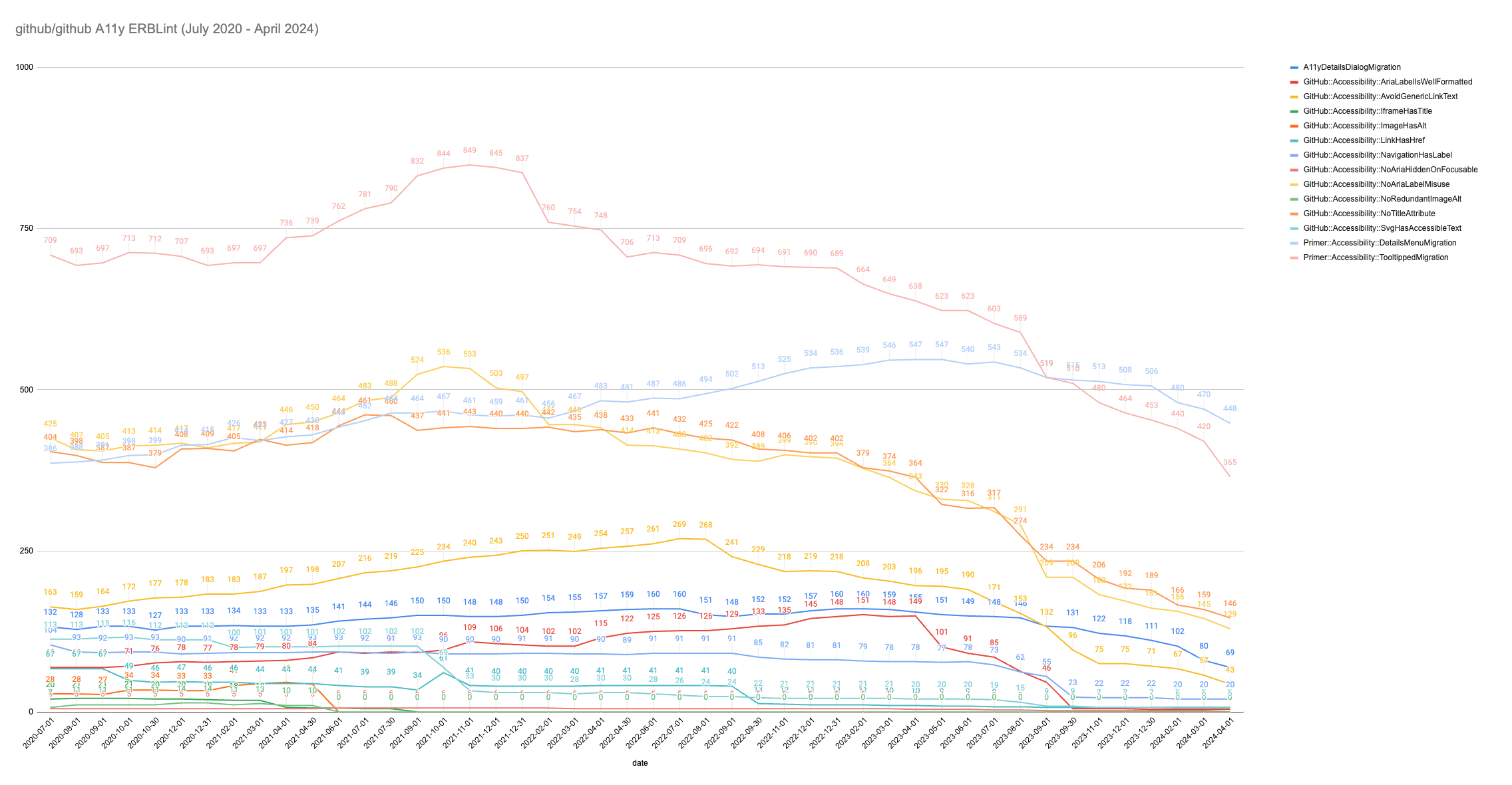
Together, these graphs helped communicate the progress we were making to leadership and led to increased investment in our program.
Takeaways
You can’t improve what you can’t measure. Even a measurement that is a proxy for accessibility can be useful to demonstrate your progress to leadership.
Durable ownership
So you’ve measured the scale of your accessibility problem and made your app Axe clean. How do you keep it that way? This question reminds me of a favorite thought experiment: The Ship of Theseus.
The Ship of Theseus is a thought experiment about whether an object that has had all of its original components replaced remains the same object. Kind of reminds me of our companies and the software we build! Code gets moved around, teams get reassigned, projects are put in maintenance mode, and people go on leave or move on to other jobs. So how do we make sure nothing falls through the cracks? A service catalog.
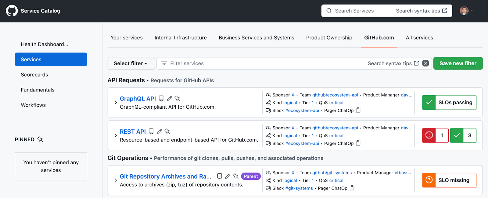
Initially built to track availability of our services, our service catalog inventories all of the technology we maintain at GitHub. Every service has an SLO, on-call rotation and chain of command up to a VP. We tag ownership in code using CODEOWNERS and programmatic tags in Ruby: map_to_service: :blob. Every line of code has an owning service, not an individual.
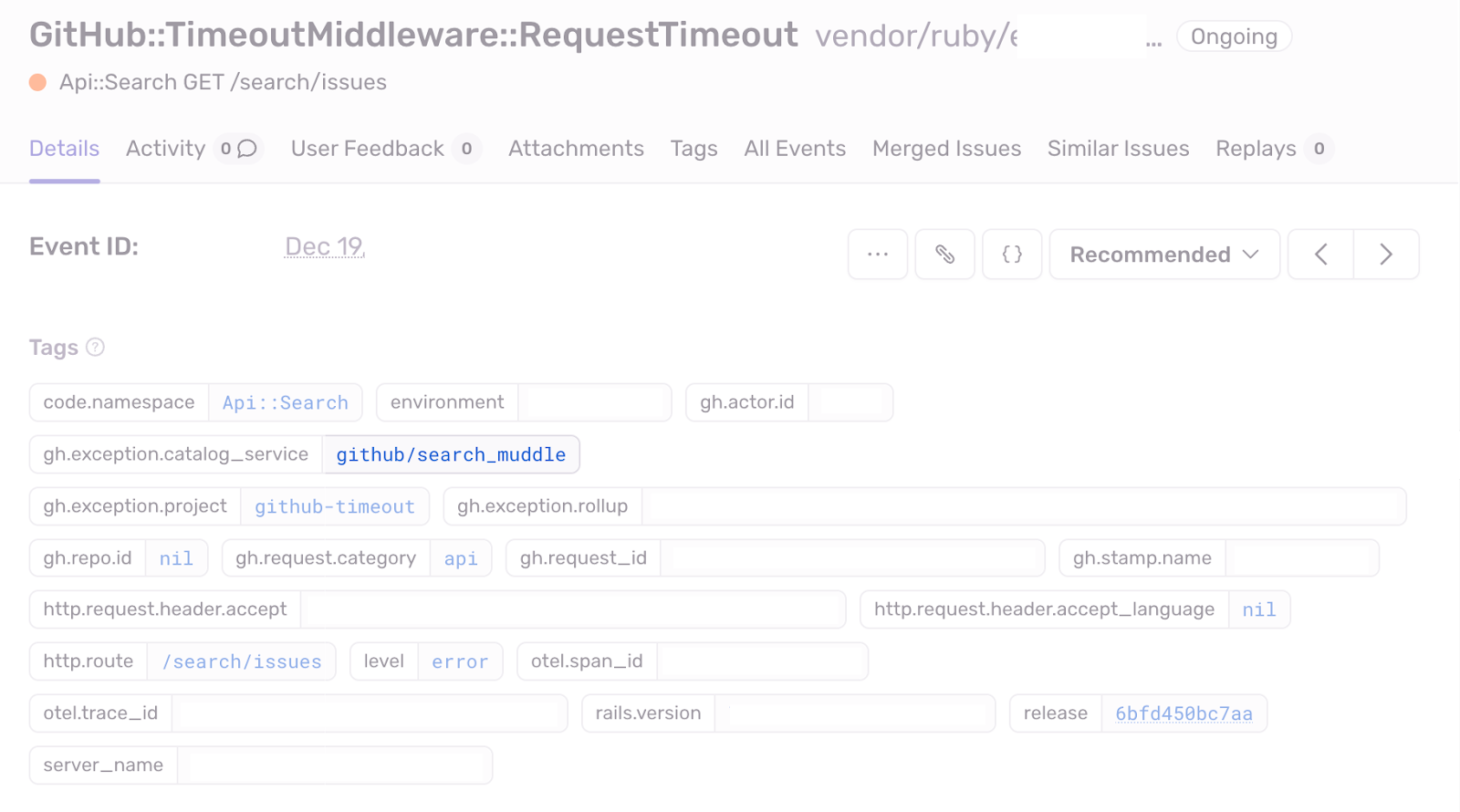
Forcing every line of code to be owned by a service has been a significant driver of maturing our engineering practices. It revealed hidden bus factors, missing playbooks, and incomplete documentation. It’s probably the single most important discipline we’ve added as we’ve scaled. It also allows us to do super useful things like automatically assign runtime exceptions to the correct on-call rotation.
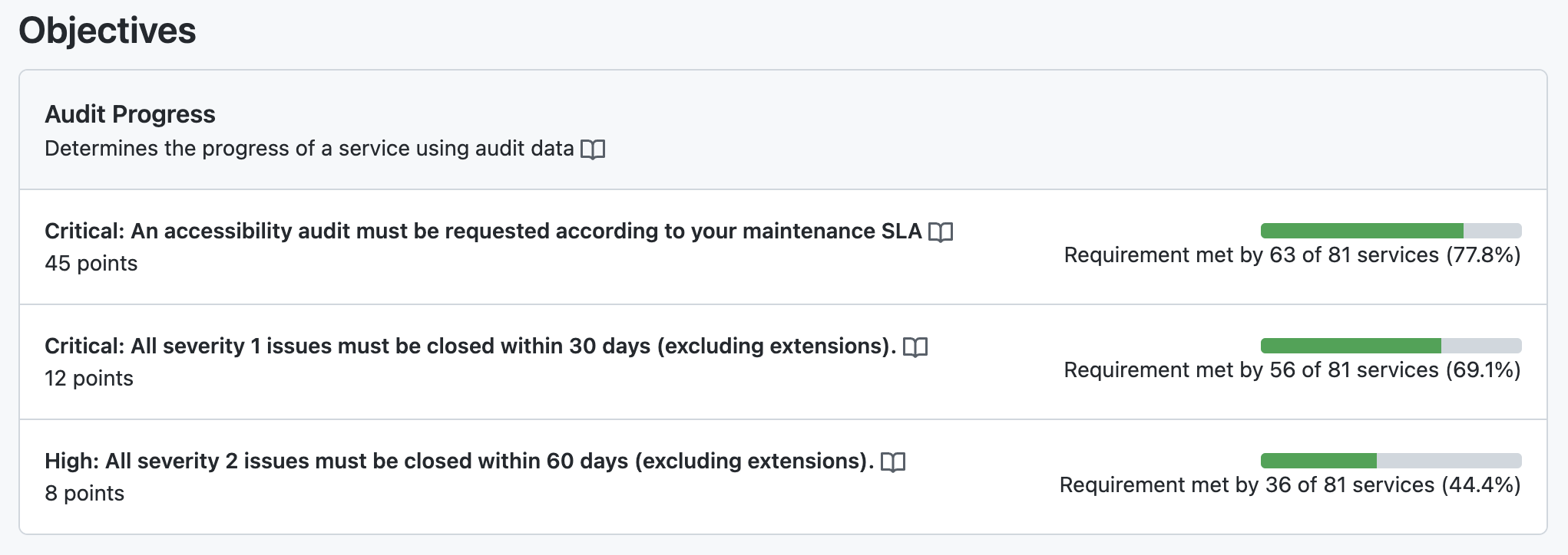
When we care about an engineering capability, we give it a scorecard and then incrementally add our services to the scorecard. Scorecards include criteria for whether a service is passing or failing and Engineering leadership is alerted when a scorecard is violated and works with teams to make it pass again. In practice this means that product teams are ultimately responsible for the accessibility of their products.
For example, we have an automated accessibility scorecard enforces that a service is using our accessibility linters and that there are no disables of the lint rules:
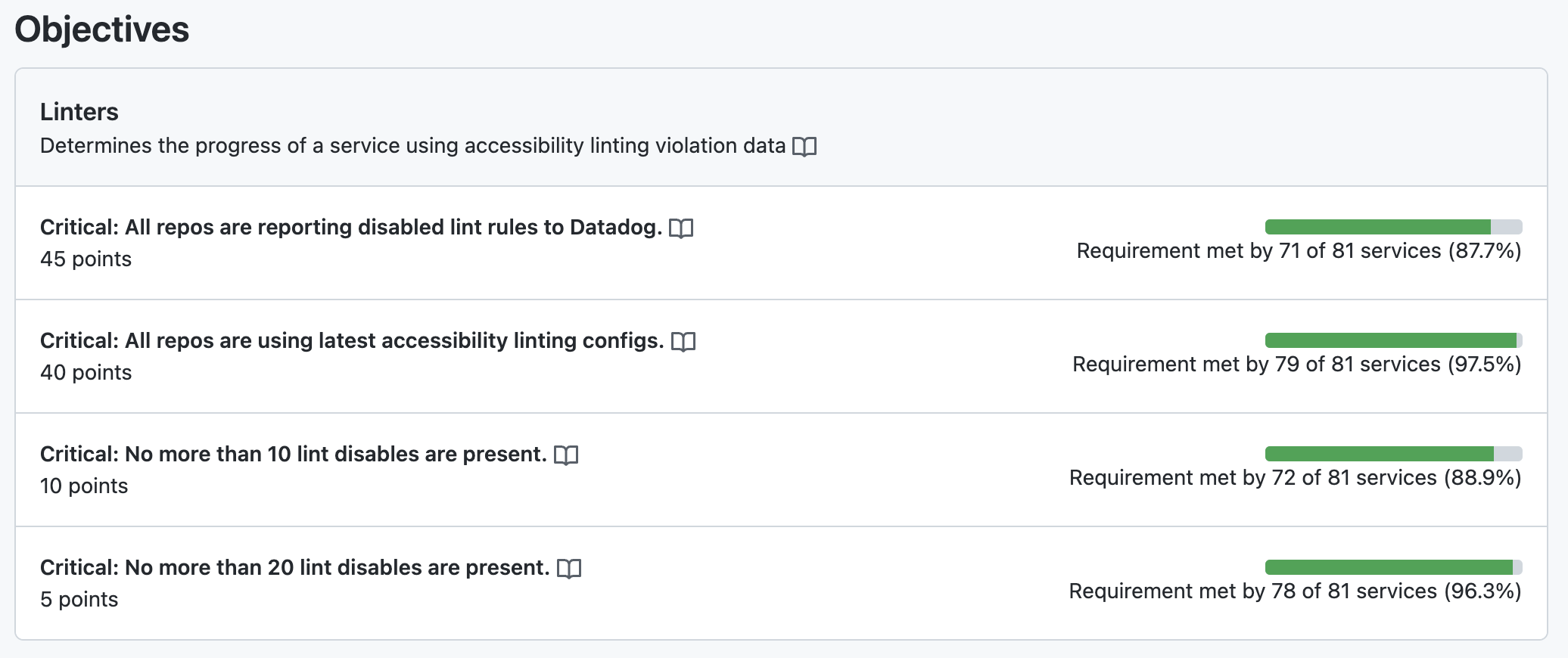
We then track scorecard participation over time to show the progress we’re making. This Datadog graph shows the number of services on our scorecard growing compared to the number of eligible services in the catalog as we worked to onboard teams to the program.
Takeaways
Code, teams, projects and people come and go. Use systems to prevent services from becoming unowned. A service catalog with scorecards can help keep teams accountable to what matters over time.
Lived experience
At the end of the day, the goal of any accessibility work is to make a product usable for as many people as possible, including people with disabilities, not to pass a specific audit or meet a certain standard. While we can get pretty far with automation and tooling, there is no substitute for lived experience.
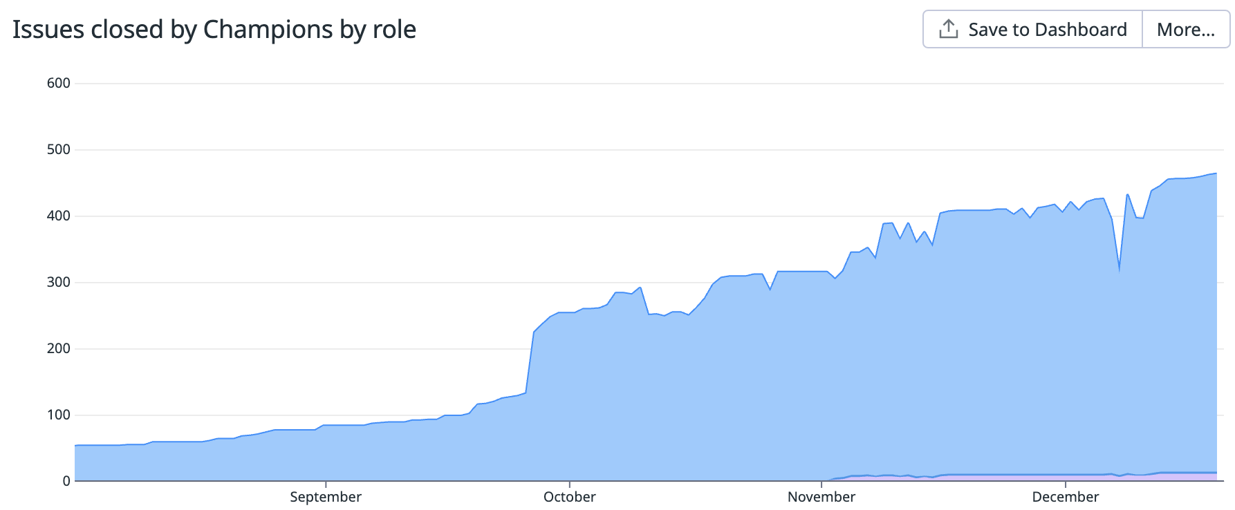
As a starting point, we taught sighted UI developers across the company how to use screen readers to test their work. We set up a champions program to train developers on the fundamentals of digital accessibility and tools like screen readers. Our goal is to have an accessibility champion on as many teams building UI as possible. To measure the impact of champions, we track the number of accessibility issues they close:
Ideally you should be having people with disabilities use your software. While we have several employees with lived disability experience, they are a small minority at the company. We’ve sought help from several consultancies who specialize in digital accessibility to fill this gap, often with startling results. I have vivid memories of being moved to tears by a consultant who showed us how hard our products were to use with a screen reader.
But consultants aren’t cheap. A good starting point could be a screen reader hackathon or passion week where your team learns to use a screen reader and tests as much of your app as possible.
Critical paths
On the product side, we’ve worked to produce Accessibility Conformance Reports (ACRs), which use the Voluntary Product Accessibility Template (VPAT) from the Section 508 standards. That’s a lot of jargon for “we document the current accessibility issues for critical workflows in our product.” This kind of disclosure is often required by large customers (especially government entities) looking to understand the accessibility risk exposure of buying our product:
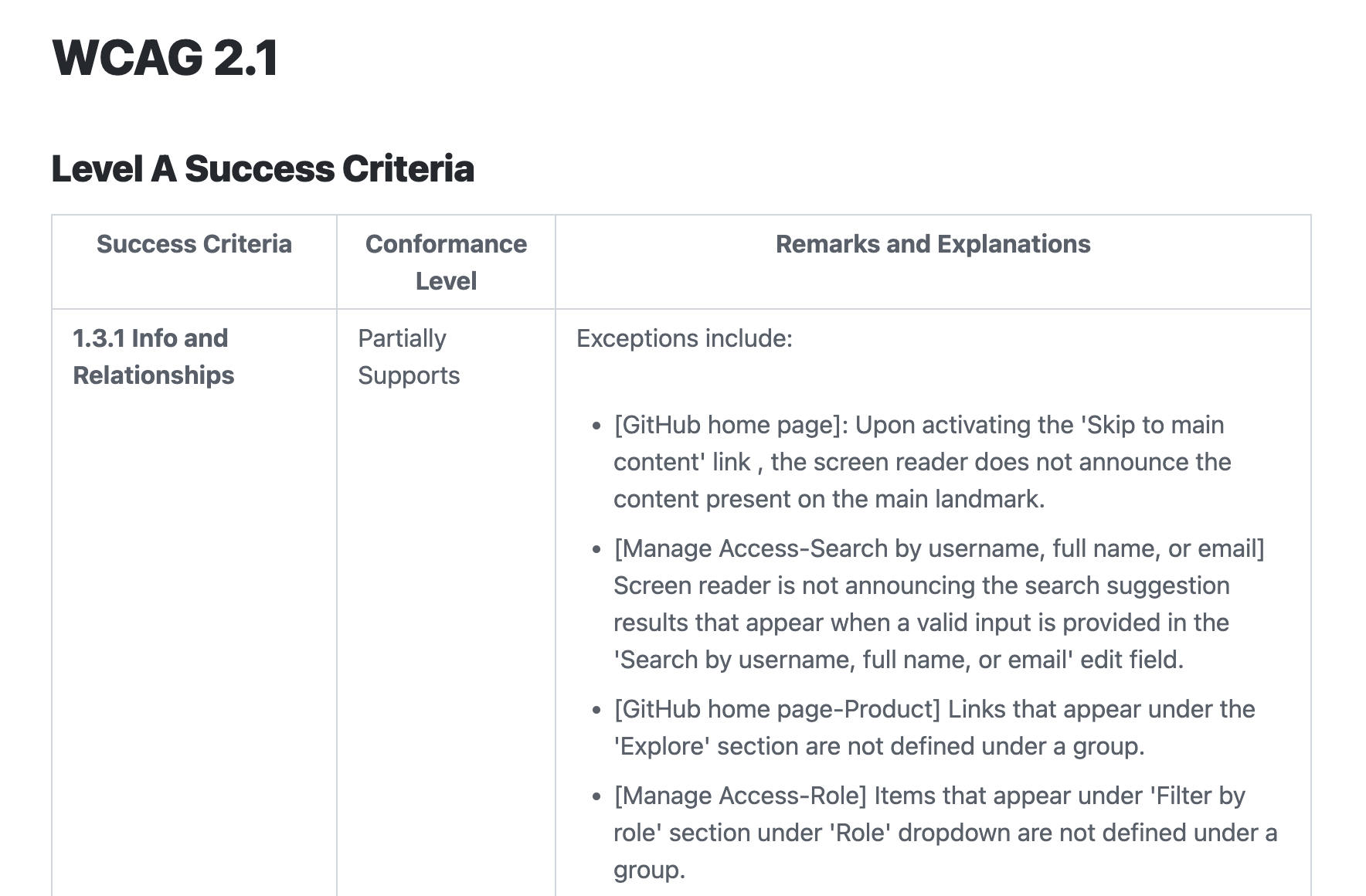
We create these reports by navigating through a dozen or so critical workflows with assistive technology and recording what issues exist. We do this every year at a minimum and more often for the most critical paths. This process requires a significant amount of investment for a product of our scale. We track what services need these audits using a scorecard in our service catalog, of course.
While you might not need this level of compliance in your application, the principle of ACRs is compelling: it forces us to identify the key experiences of our products and to see if they are usable by customers with disabilities. We’ve found that it’s pretty easy to make the case to non-technical stakeholders that people with disabilities should be able to give us money and get value out of our products. The last thing we want is for someone to tell us they can’t do business with us because of their disability. In fact, our largest customers are increasingly the ones requiring accessibility compliance.
Want to try this approach in your application? I’ve written the first three user stories for you:
1) As a screenreader user, I can sign up for an account. 2) As a screenreader user, I can upgrade to a paid account. 3) As a screenreader user, I can complete the workflow for my product’s most compelling use case. (In our case things like opening a PR, completing the code review process, passing CI, and merging a PR)
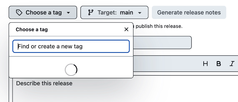
One key technique we’ve adopted here is system tests for keyboard navigation. We started by taking existing system tests that clicked on UI elements and rewriting them to use keyboard navigation. For example, this test creates a new release from a tag using a keyboard:
test('keyboard-only navigation for selecting a tag works', async ({page, repoUrl}) => {
    await page.goto(repoUrl + '/releases/new')
    const summary = await page.getByRole('button', {name: 'Choose a tag'})
    await tabTo(page, summary, 'Enter')

    const tagInput = await page.locator('input[aria-label="Find or create a new tag"]')
    await tagInput.fill('v1.0.0')

    const createTagOption = await page.getByRole('menuitemradio', {name: `Create new tag: v1.0.0 on publish`})
    expect(createTagOption).toHaveCount(1)
 })
What’s wild here is that when my colleague Kate Higa went to convert this test to use keyboard navigation, she found a screenreader bug!
As it turns out, the list of tags on this page never loaded if a mouse cursor was not present in the window! This was literally the first test she tried converting and we validated that the page was indeed broken for screen reader users.
Besides automated tests, try having engineers use your application without a mouse, perhaps even having “no-mouse Fridays!” Making your application Axe clean and keyboard navigable will get you pretty far towards being accessible to users of assistive technology.
Power
But ultimately for lived experience to matter, we need to employ people with disabilities. Then, we need to give them power. In our case, we hired a fantastic head of accessibility with decades of experience to lead our accessibility efforts from the legal department. He also happens to be a screen reader user! I believe creating his position and giving him authority has been the most important decision our leadership has made in my time at GitHub.
Takeaways
While automation can do the heavy lifting and ownership can ensure accountability, there is no substitute for lived experience. Give people with disabilities in your organization the power they need to make your product work for them.
Conclusion
It’d be disingenuous to not mention that this work is hard. It’s expensive, time consuming, and will almost certainly slow you down. Beyond being the right thing to do, customers increasingly require it. Selling to the government and big business often means more compliance burden, and it can limit how quickly a company can innovate! But if we don’t pursue this work we run the very real risk of leaving those with disabilities behind in a time of incredible technological progress.
Here is my challenge to you: measure your product’s accessibility, own up to it, then give people with lived experience the power to make it better.
Thank you.
Thanks to @kendallgassner, @ericwbailey, @khiga8, @lindseywild, @timtyrrell, and @jfuchs for contributing to and reviewing this presentation.