
|
Hi! |

|
I want to start with gratitude. First and foremost for all of you. I’m so grateful for the Ruby community we have here in Boulder and am proud to be a part of it. I’m also proud of how we’ve stuck with it for what must be almost 20 years at this point, right Marty? |

|
I’m also grateful for all of your attention, once a year, to share what I’ve learned. I hope what I’ve prepared for you all is enlightening and can help you improve at your craft, or at the very least, see the world in a new light. Basically every Boulder Ruby talk I’ve given has been about something related to UI architecture. |

|
My first time giving a talk at the meetup was when I was working on creating ViewComponent way back in early 2019. My talks since then have built on each other, following the evolving dynamics of the UI discipline at GitHub. Today’s presentation, my 7th, will be the last in this series. Late last year, for reasons that aren’t interesting enough to elaborate on here, I was moved to another organization at GitHub, marking an end to nearly five years of working on our UI architecture. It was a bittersweet moment for me, as I had envisioned many more years working in the discipline. |

|
As you might imagine, there were lots of thoughts and feelings going through my head when I was reassigned. This change came right as I was thinking about what I would talk about this year. Today I’m going to reflect on what I’ve learned working on GitHub’s UI architecture and what lies ahead for our discipline in the future. My goal is to share our experiences so they can help inform similar decisions you’ll make in your careers. |

|
So as a quick intro, my name is Joel. I live just down the road in Louisville with my wife and son. I’ve been building for the web for about 20 years now with over a decade working in Ruby on Rails. I got my start here at MojoTech, and in fact moved to Colorado when the Boulder office was first opened. I’ve since worked at a couple local startups before joining GitHub in early 2018. |

|
Almost seven years later, I have no plans of leaving GitHub. Which honestly feels weird to say, given how short tenures tend to be in the industry. I love the culture, the problems I get to work on, and the wonderful colleagues I work with just as much as I did when I first joined. I recognize how extremely privileged I am to say that. Even amongst peers in the industry, it’s unusual to feel this way about a job. But what has struck me the most about this mindset has been how it has changed my perspective on being a software engineer. |
|
One of the greatest parts of working on a single codebase for so long is getting to watch the entire lifecycle of your decisions. From idea to prototype, internal release, public availability, widespread adoption, and finally long-term, keep-the-lights-on support, we have so much to learn. When you're switching companies every year, two, or three, you’re missing out on learning those lessons. (As a spicy note, this is something I reflect on when I consider DHH’s worldview- Basecamp is rewritten every so often, so I think he is sheltered from the problems faced by maintainers of monoliths that aren’t rewritten.) |

|
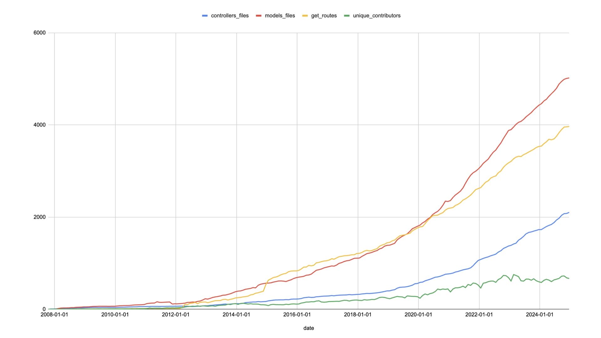
I’ll start with my usual disclaimer: GitHub is a big company. What I’m sharing might or might not be relevant in your specific situation. Usually I’d share some stats about numbers of models, views, controllers, etc., this time I wanted to do something better: time-series data! So I made a script similar to `rails stats` and ran it against one commit per month for the entire history of the GitHub monolith. |
|
Today, we have about 5,000 models, 4,000 routes that render UI, and 2,100 controllers. There are about 650 people actively contributing to our monolith in a given month. |

|
I’ve open-sourced the script I used to generate this data [here](https://github.com/joelhawksley/rails-history) if you care to run it on your codebases. So with that context out of the way, let’s get to it. Today I’m going to share three lessons: |

|
Native as the new baseline |

|
The UI abstraction paradox |

|
Why frontend costs 10x backend |

|
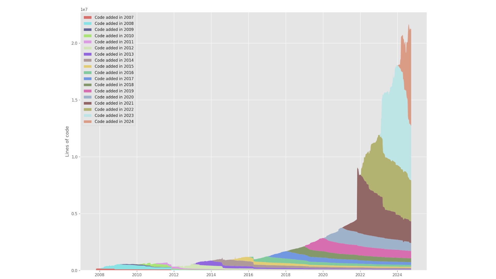
Native as the new baseline GitHub’s UI has gone through several eras, and you can see them to this day when browsing our views directory. One way to visualize this is with a tool called [git-of-theseus](https://github.com/erikbern/git-of-theseus). Running it on our nearly 2 million commits took a couple of days on an M1 Max: |
|
As you can see from this graph, our code sticks around! We aren't necessarily going back and deleting or significantly changing what has already been written. Which means that in a lot of cases, what we commit is frozen in time. That is, until it has to change. In my time working in this area at GitHub, our standards for building UI have drastically changed, with the effect of making doing things the “right” way more and more complex. |
|
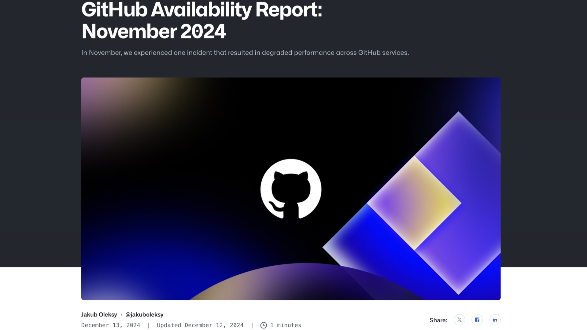
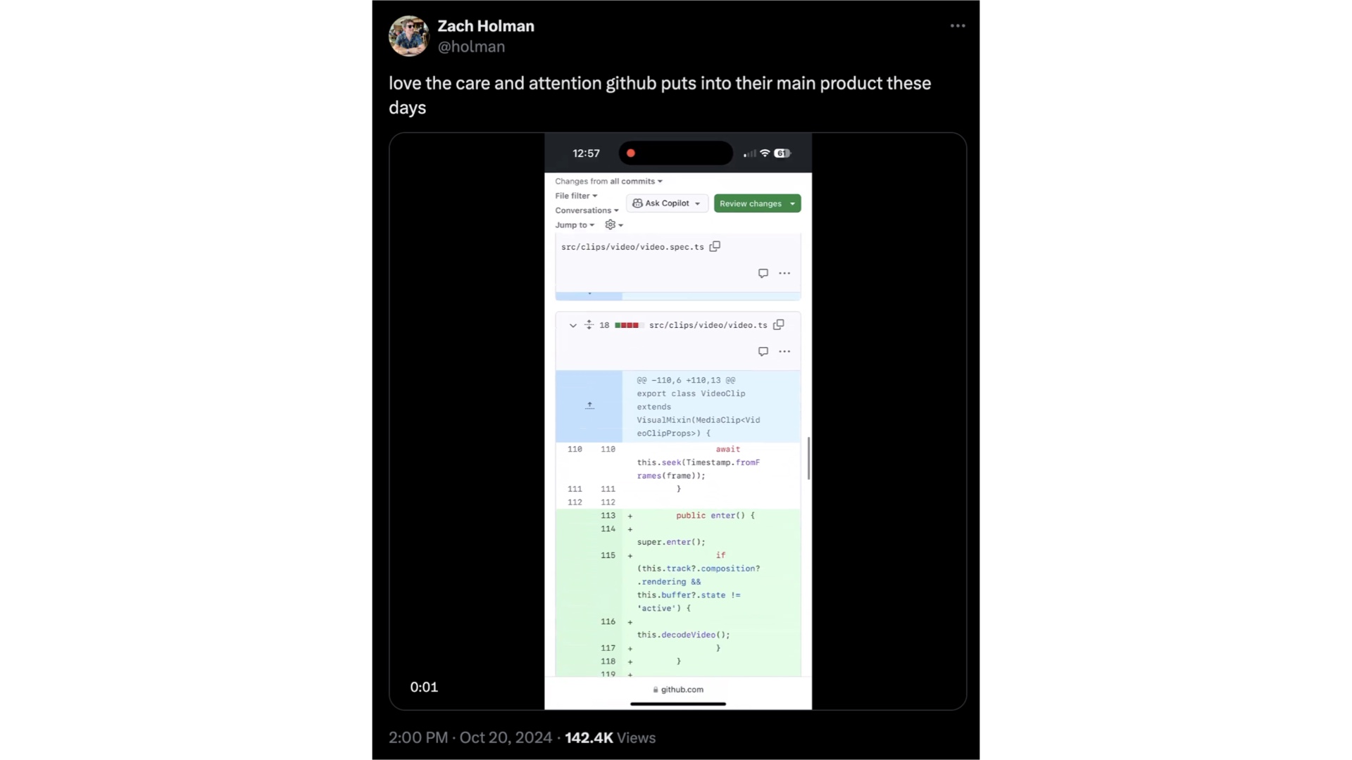
For example, we now have availability and accessibility standards that didn’t exist when I joined the company. I’ve discussed the accessibility standards at length the last two years, but our [availability expectations](https://github.blog/news-insights/company-news/github-availability-report-november-2024/) are worth mentioning here: For a long time, we accepted some amount of UI regressions as normal. While we never measured how many times we shipped UI bugs, it was generally accepted that we would never catch them all, but that we could rely on our ability to “fast follow” with either a rollback or bug fix when we (or just as often, someone on Twitter) |
|
noticed a regression. That is no longer the case. We now consider UI bugs like any other bug, counting them against our availability scores if they are blocking users from using the product. Our standards are [three nines](https://uptime.is/three-nines) (99.9%), or about 8.5 hours of downtime a year. When a single CI and deploy cycle take at least half an hour, that doesn’t leave much, if any room for UI regressions that require a deploy to fix. In discussions with other peers in the industry, these availability and accessibility standards are an exception to the rule. Many companies simply don’t prioritize them as much. This can mean that those who don’t understand the implications of those standards may expect us to deliver more than we do, especially folks joining GitHub from organizations with more lax expectations. But beyond accessibility and availability, there is also a growing expectation of GitHub being more app-like. |

|
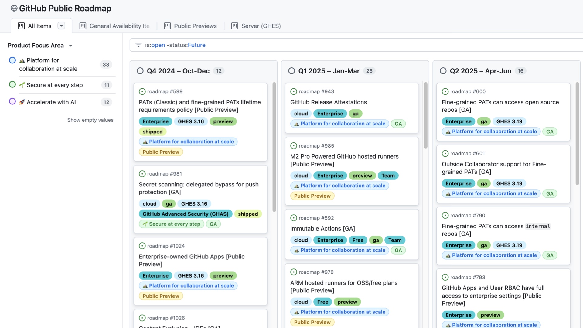
One question I get whenever I tell someone I work on UI at GitHub is whether we are rewriting all of GitHub in React. Our current plan is to build new experiences in React, especially when they are app like. |
|
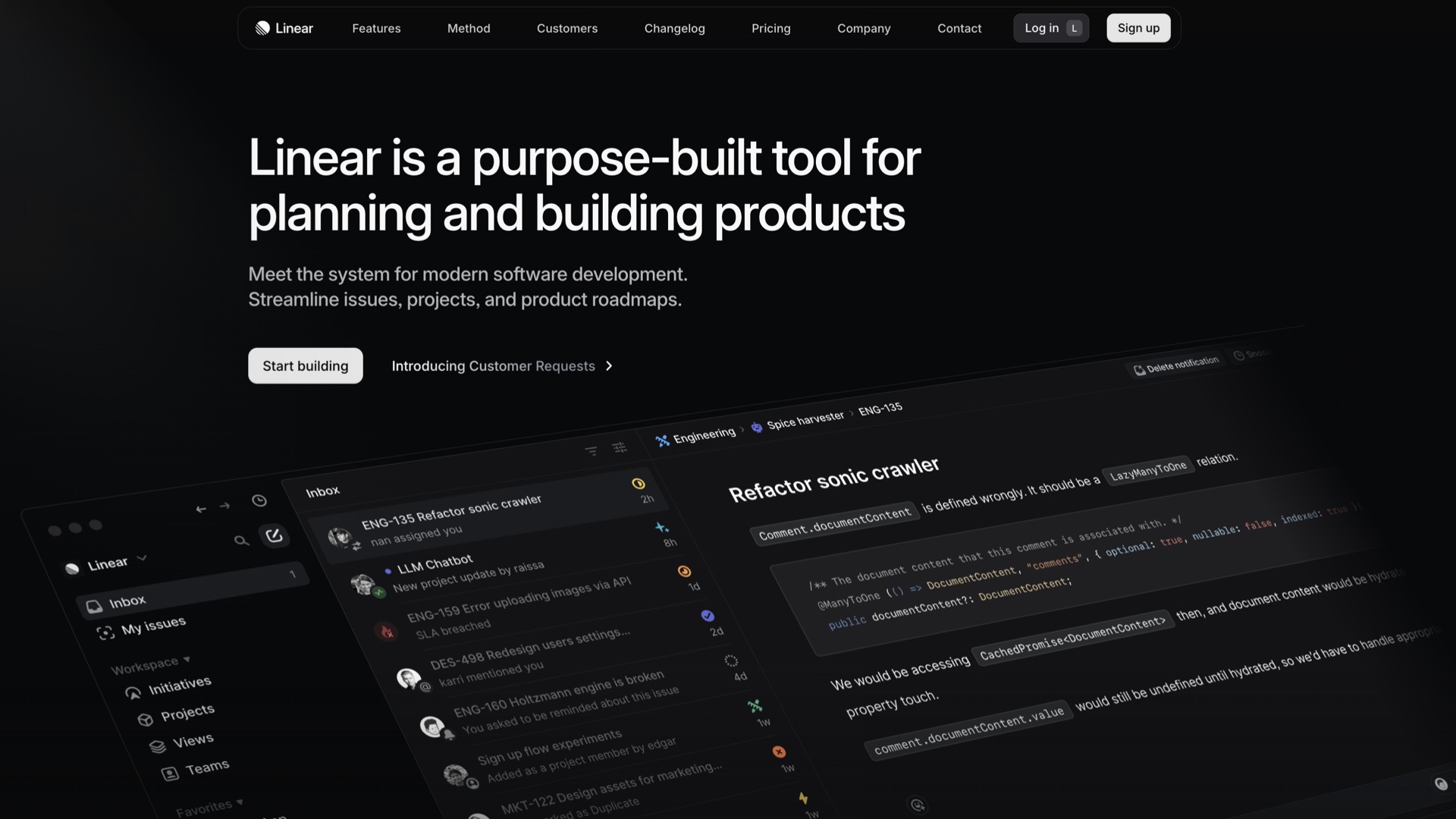
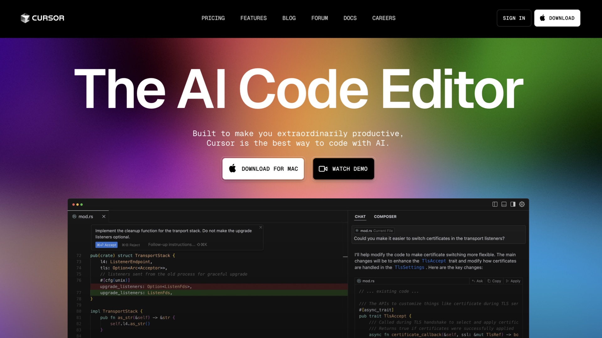
The first case of this was when we rebuilt GitHub projects to bridge feature gaps with Azure DevOps, as MS wants to migrate AZDO customers to GitHub. More broadly, GitHub is seeing market pressure from more app-like competitors, such as |
|
[Linear](https://linear.app/) and editor-based tools like |
|
[Cursor](https://www.cursor.com/) |
|
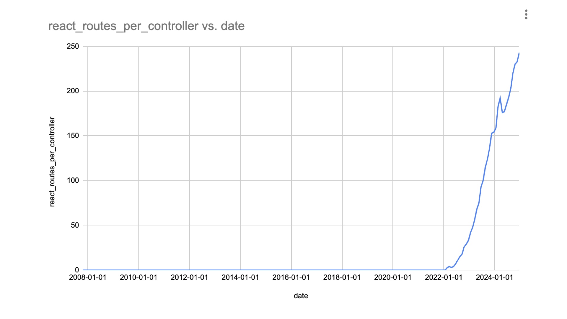
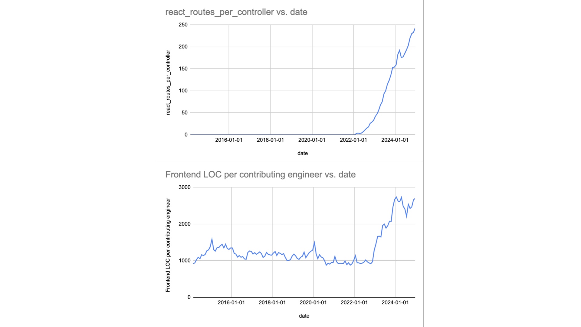
We made this decision a couple of years ago, and since then we’ve added about 250 React routes that serve about half of the average pages used by a given user in a week. But I think the root cause of this pressure to be more app-like is much broader. As software continues to eat the world, a new population of consumers is emerging. |
|
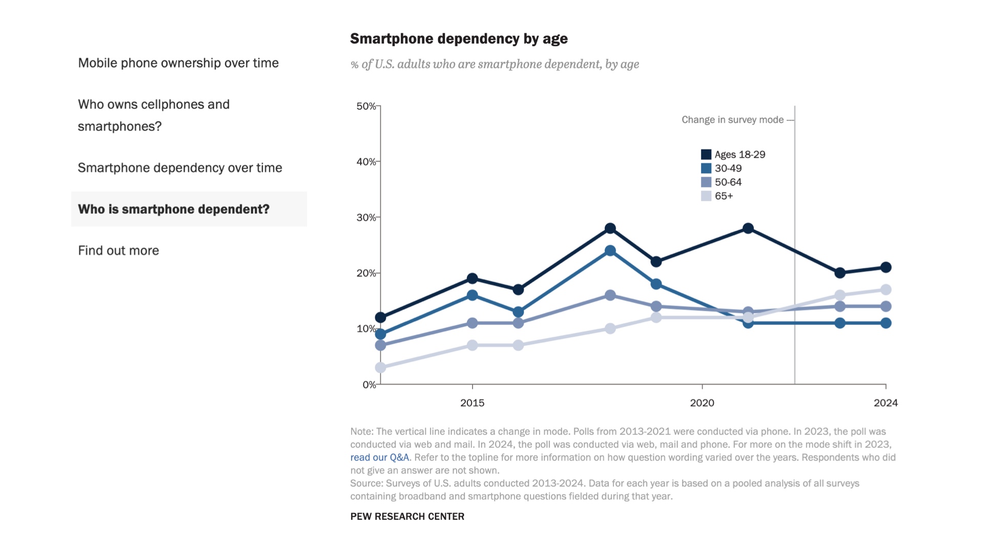
According to [Pew Research](https://www.pewresearch.org/internet/fact-sheet/mobile/), 15 percent of U.S. adults only access the internet through a mobile device. |
|
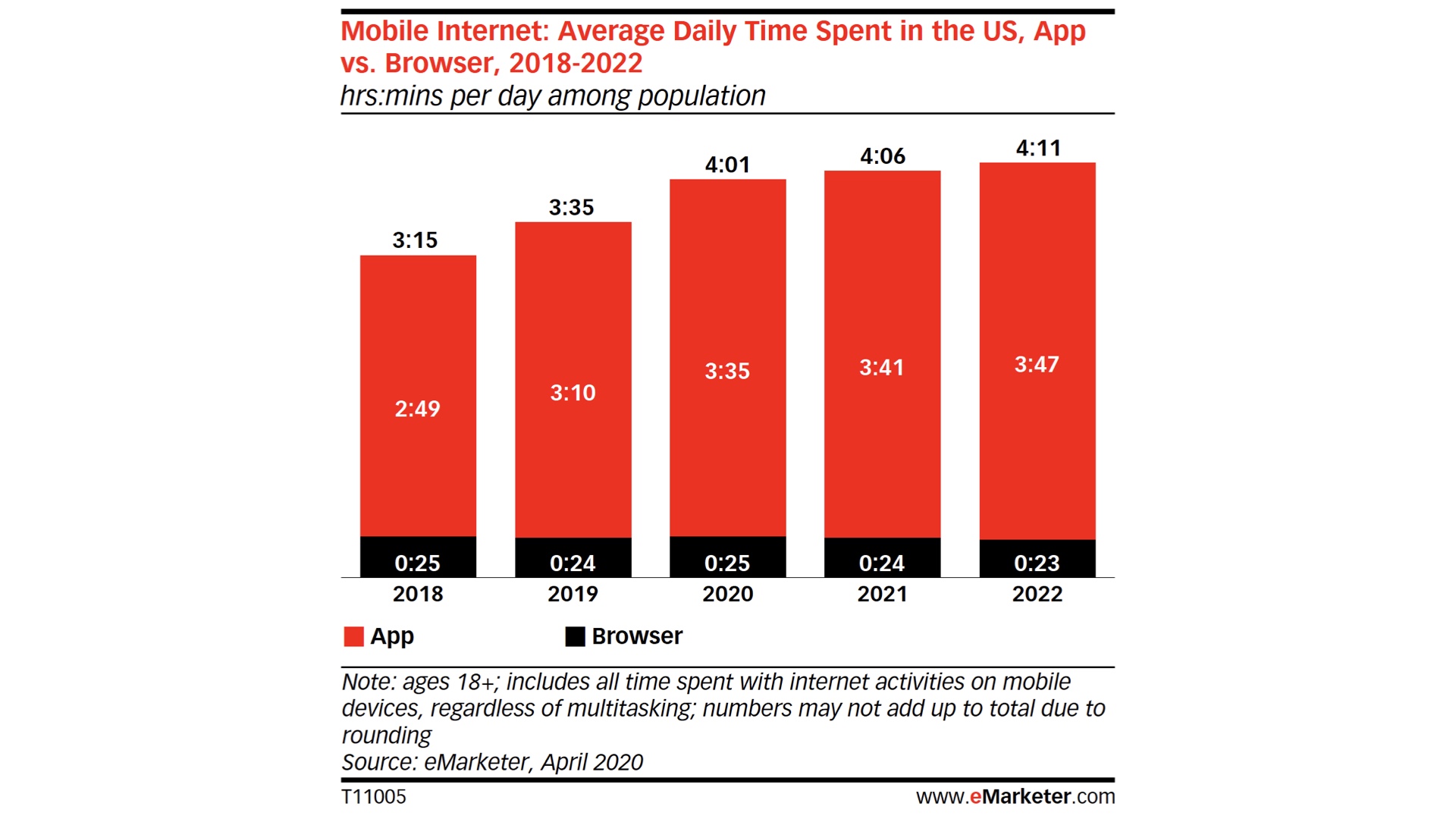
Various reports estimate the around 90% of internet usage on mobile devices is [in apps](https://www.emarketer.com/content/the-majority-of-americans-mobile-time-spent-takes-place-in-apps). If you use apps all day, websites are a step back. Which is all to say, that mobile is the new baseline. And we’re trying to match it using a technology stack originally built for displaying documents! While the Web has come a very long way, it wasn’t built from the ground up for building experiences that compete with the fidelity of native mobile applications. |

|
I know I’m not the only person in the Rails community who has desired to keep the web the “way it was”, but times are changing. Consider this question: would you book an entire vacation using only your phone? Some people joke that this is the best way to tell the difference between millennials and younger generations. I’ll admit that this realization snuck up on me. |

|
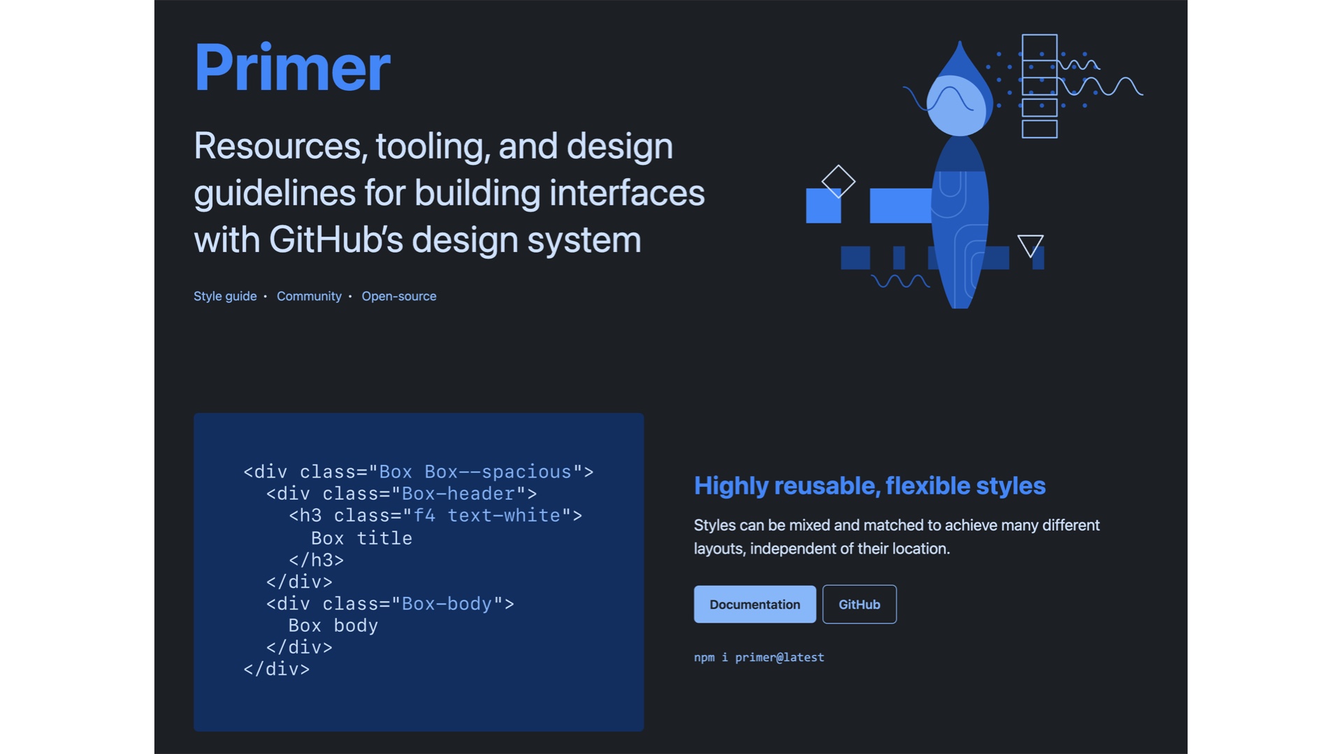
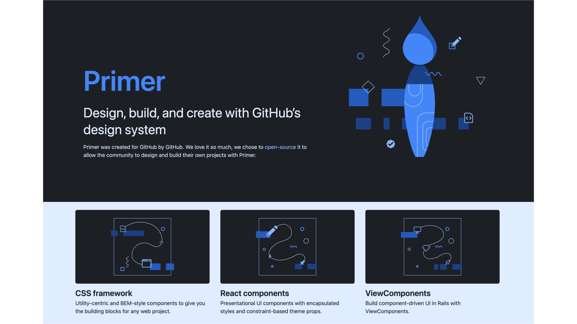
Of all the ideas I’ve seen through their lifecycle in my time at GitHub, it’s design systems. And unfortunately, there are sobering realities of design system adoption at scale. As our availability and accessibility pressures have mounted, more and more teams have looked to our design system to help them meet those standards, as they should! But it’s had the effect of putting the hopes and dreams of many UI goals of the company on the shoulders of only a few people, in our case seven engineers staffed on Primer vs. around 650 working on the monolith. And you can see this pressure in the very architecture of our design system: |
|
for a long time, Primer was just a library of CSS classes, much like Bootstrap was and Tailwind is today. But as we looked to improve availability and accessibility, we found it necessary to encapsulate markup and behavior, not just styles, leading us to |
|
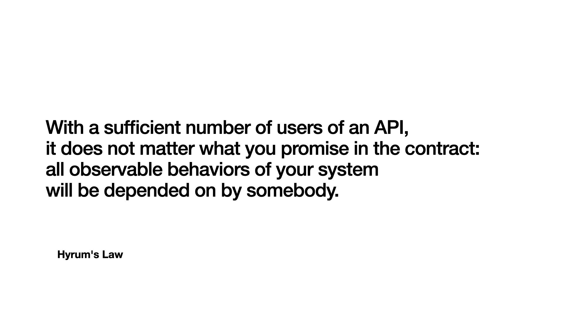
React and ViewComponents. But it’s honestly been a struggle to build and maintain a design system that meets our standards, especially multiple implementations of it. Primer is a victim of its own success: the more it’s adopted, the harder it is to change. Our experience has been the perfect example of [Hyrum’s Law](https://www.hyrumslaw.com/): |
|
|
|
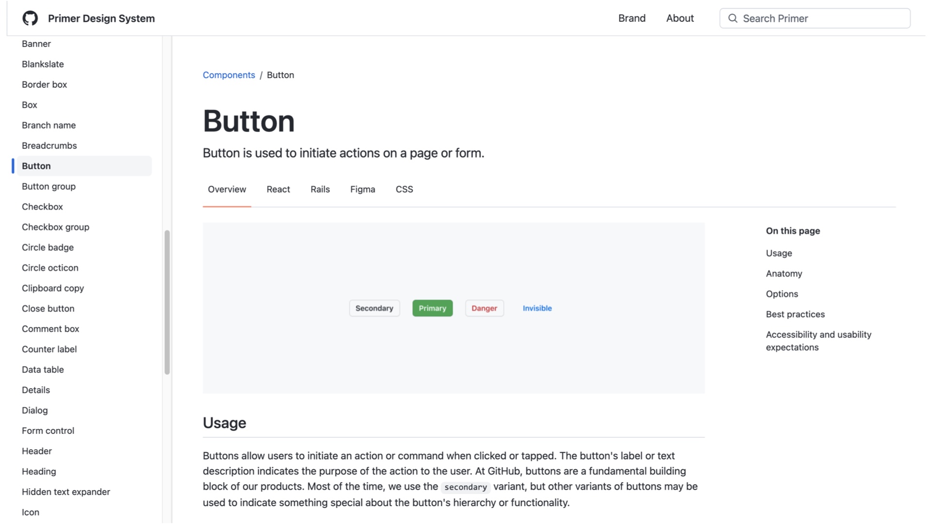
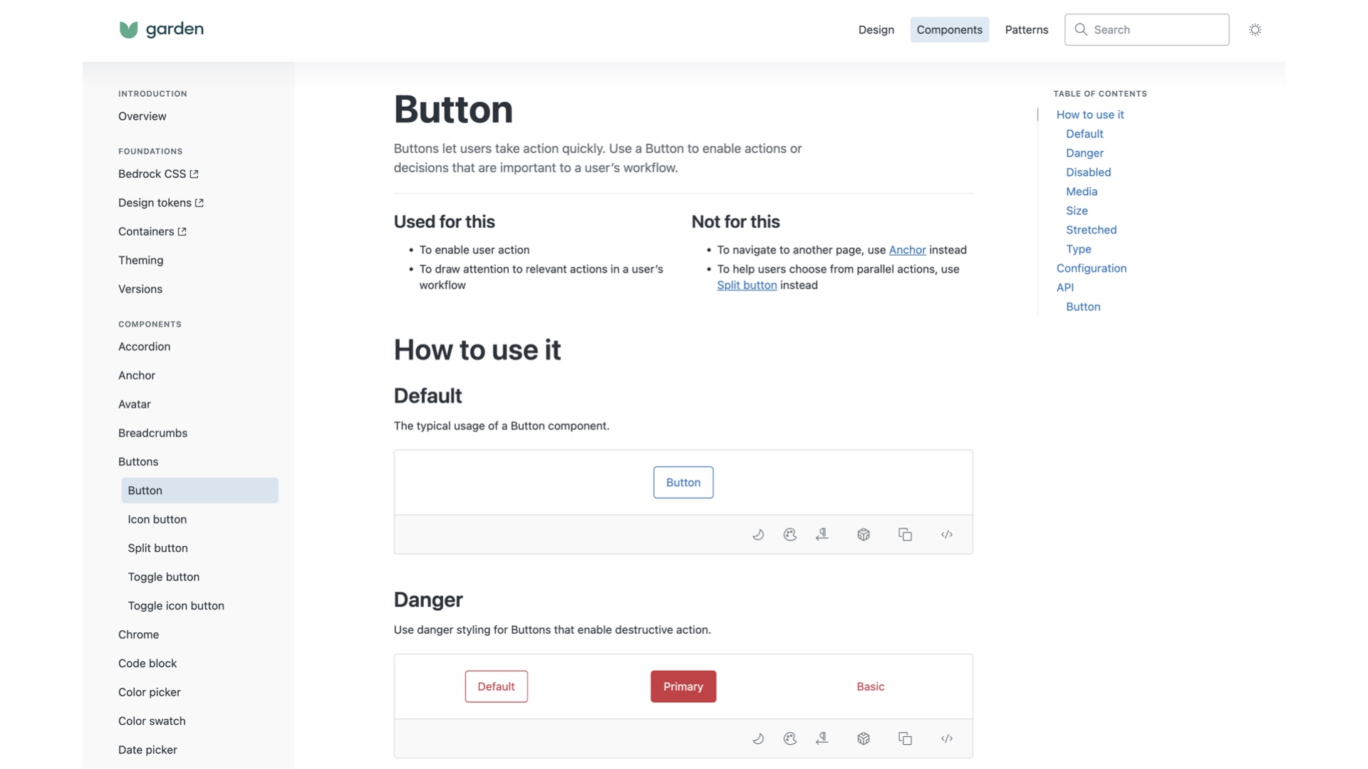
For example, take our Button component. It’s pretty simple, right? But it’s used 5,000 times in the GitHub monolith alone, 4,000 times in Rails and 1,000 times in React, sometimes in ways we don’t anticipate and don’t have tests for. While we do what we can to isolate our styles, the global nature of CSS makes it difficult to have the level of confidence we need to sleep well at night when shipping even small UI changes. This means that making changes to the button are really hard to make confidently, no matter how small they are. Upgrading the version of Primer in GitHub.com has become increasingly stressful. While we’ve made strides towards reducing risk with tools like feature flags, we still ultimately rely on manual testing critical flows. Compared to similarly-shaped problems on the backend, we’re significantly behind in terms of confidence in our releases. But there is a bigger problem. Why are there so many design systems in the first place? We’re all inventing solutions to the same problems, and I can’t help but feel that there is a great deal of human potential being wasted on that duplication of effort. Want to see what I mean? Here is the same Button component documentation from ZenDesk’s design system: |
|
The level of sameness, down to the structure of the documentation site itself, is eerily uncanny. Some of you might see where I’m going: I believe it’s time for us to consider a Global Design System. And I’m not alone: |

|
Brad Frost is leading an effort: https://bradfrost.com/blog/post/a-global-design-system/ I’d encourage you to give it a read! |

|
So what does this mean for you? For one, I would recommend against building your own design system. We’ve even toyed with the idea of theming an existing design system (such as Radix) instead of building every new component we need ourselves. And we’re GitHub! 1500-engineer GitHub. |

|
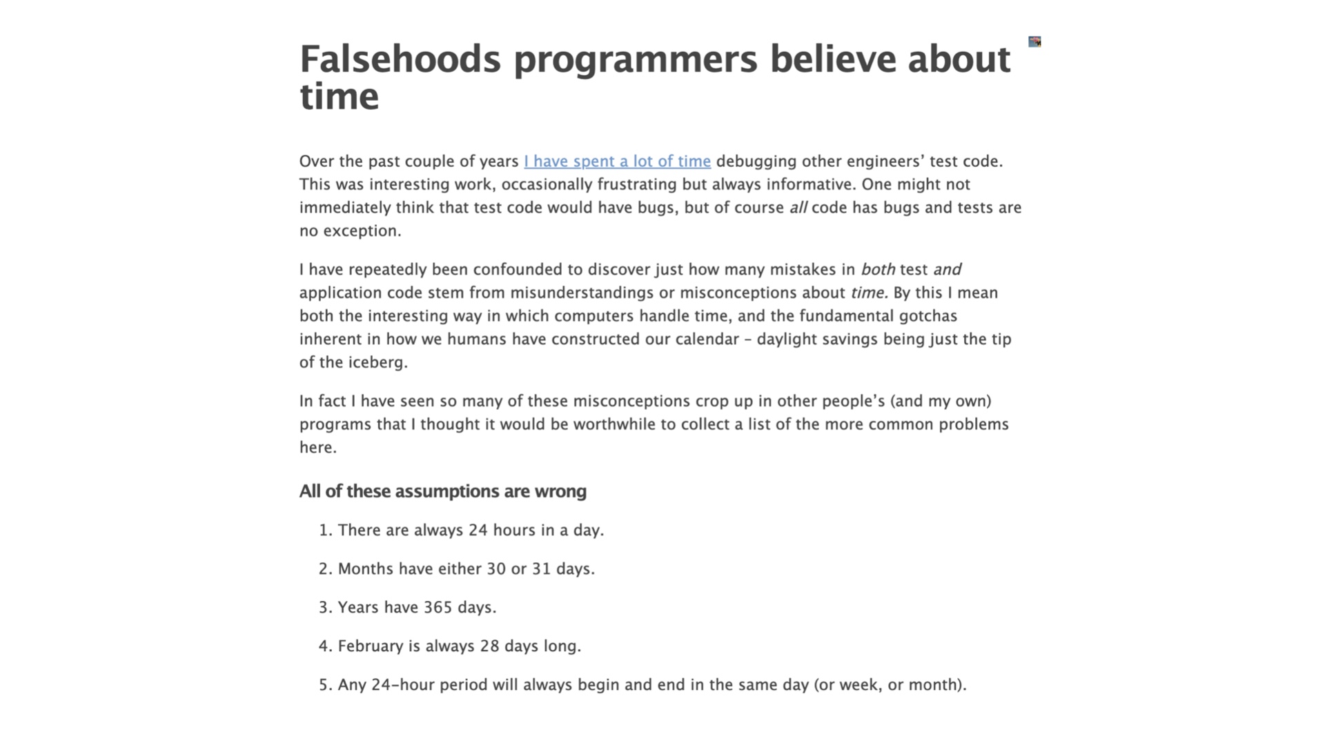
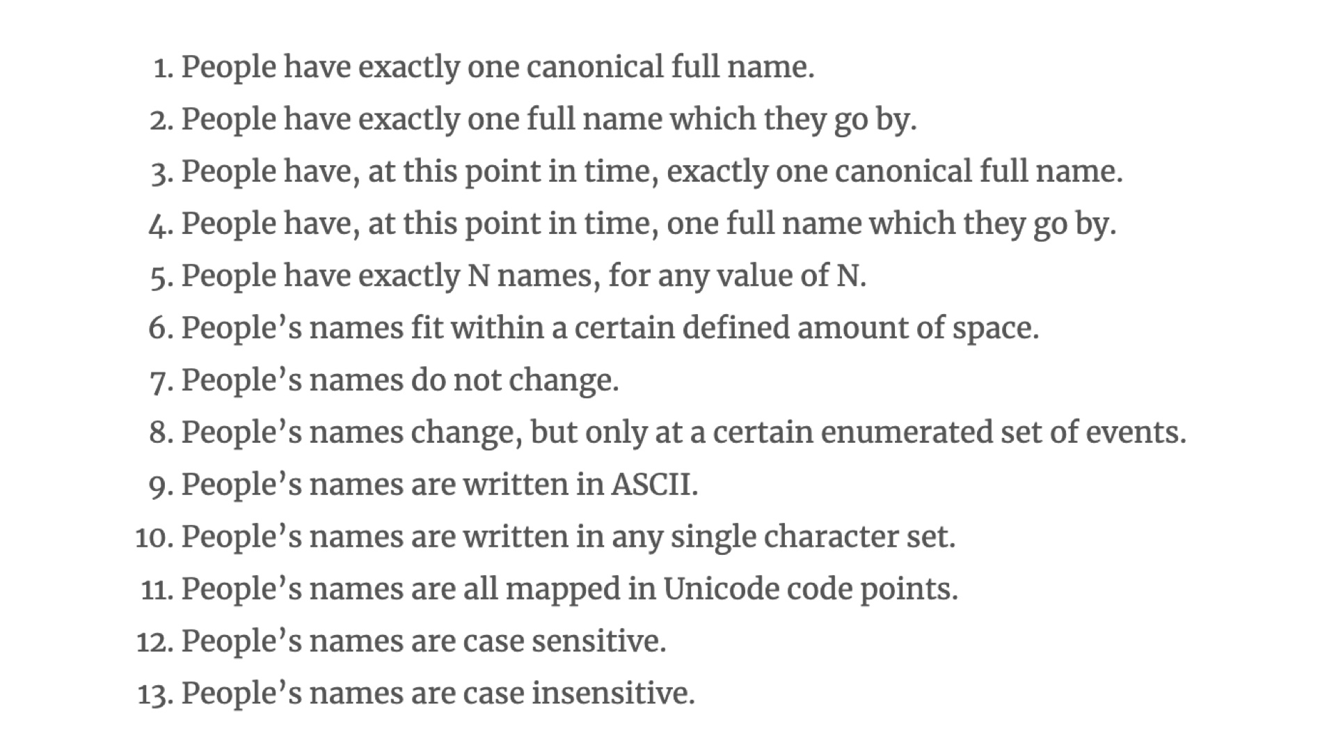
One of my favorite series of articles is the “falsehoods programmers believe about X”, |
|
especially the lists on Time (https://infiniteundo.com/post/25326999628/falsehoods-programmers-believe-about-time) |
|
and names (https://www.kalzumeus.com/2010/06/17/falsehoods-programmers-believe-about-names/). |
|
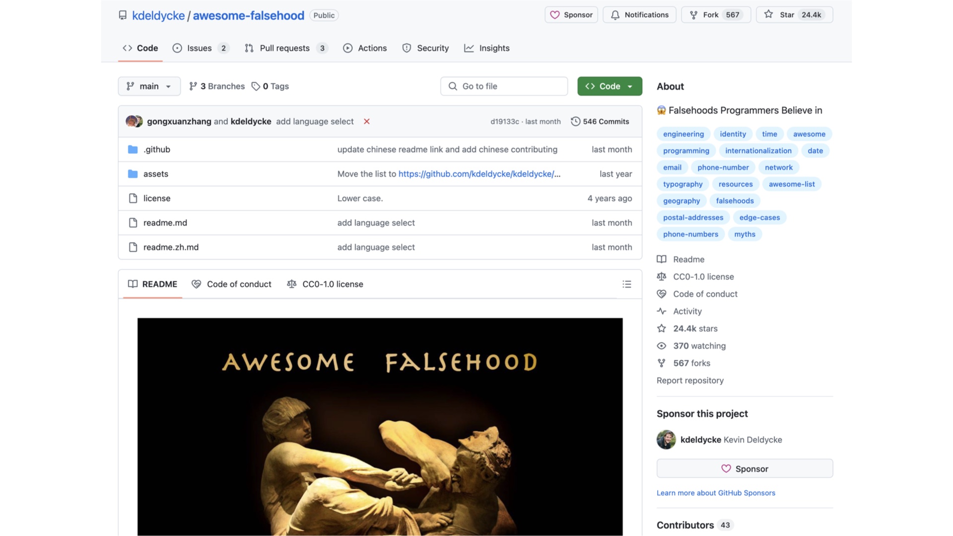
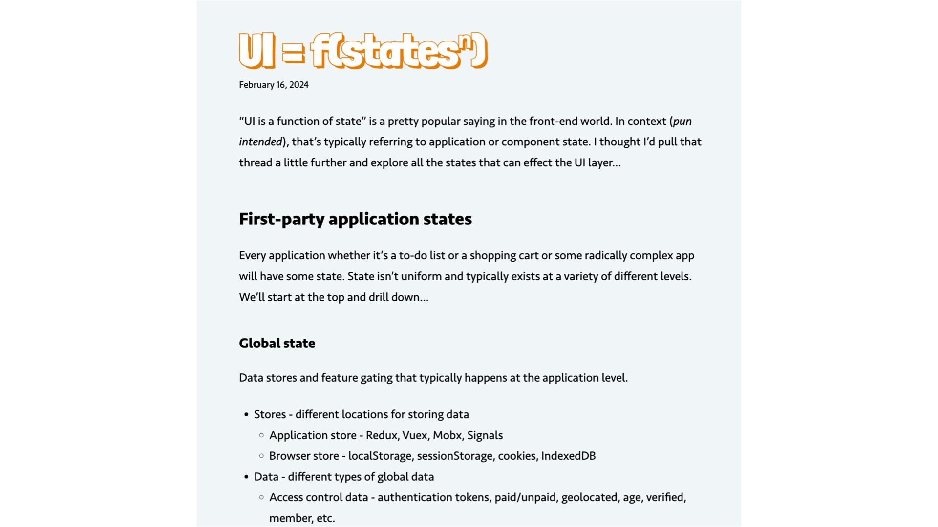
In my research for this talk, I found a meta list of these articles: https://github.com/kdeldycke/awesome-falsehood, in typical Awesome X format! But I think there is an article missing from that list, by Dave Rupert: |
|
Which I think he should have called “falsehoods programmers believe about UI.” In his article, Rupert elaborates on the dozens of runtime inputs that can affect UI, many of which are outside the control of us developers. For example, browser extensions! So many UI bugs we have at GitHub are caused by browser extensions. I’d guess that it’s a significant fraction. This is madness coming from the backend world. |

|
We run all of GitHub.com on a single version of Ruby, |
|
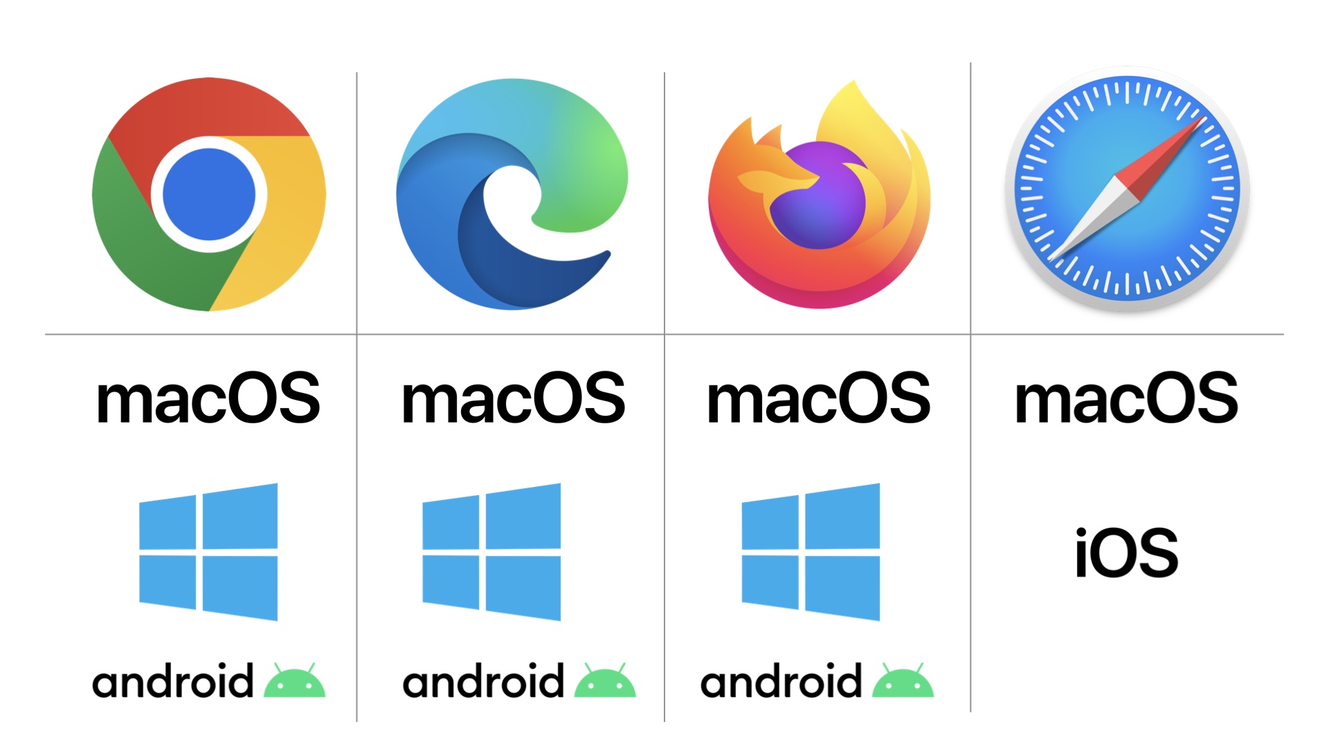
But our HTML, CSS, and JavaScript runs on several major versions of each major browser |
|
Across a matrix of possible hardware stacks You’d think that with such a massive difference in runtime variety that we would test our frontend code as thoroughly as possible, at least as thoroughly as our backend code, right? So why aren’t we testing our frontend code like our backend code? For one, browser tests are slow and flaky compared to backend unit tests. But it’s also more structural: our backend code is more *testable* than our frontend code. Before we had components, we didn’t even have an abstraction *to test* that wasn’t an entire page, so that's how we wrote our tests, at the system level. |

|
Thankfully, with component-driven UI, we are quickly turning the corner on this issue. We have effectively total test coverage for our components. But that isn’t enough, due to how varied the frontend runtime can be. Think about the amount of tooling and research around making perfect backend code. We can, with a bit of math, prove that mission critical systems such as avionics and S3 are immune from certain failure modes. In my research, there are little to no robust guarantees around frontend. |
|
So as our application grows, so does the amount of frontend complexity we have to manage. Looking back at our graphs, the number of lines of frontend code per contributor was been stable for the past decade, until we started adopting React. For frontend lines of code, I summed the total number of lines of SCSS, CSS, viewcomponents, ERB, javascript, and typescript, excluding all test code: This sign is concerning to me. Wouldn’t we expect our UI code to become less complex over time, given the availability of better abstractions like an increasingly usable design system? One contributing factor I’ve observed is that design is not bound by the same constraints as engineering. |

|
There is an imbalance in change cost between engineering and design. A designer could build a year's worth of engineering time in a week, maybe even a day or an hour. We have designs from four years ago we’re still aspiring to build! Because there are few natural limits, it's easy to build designs that are difficult to implement. But the reality for us is more subtle. It’s fairly uncommon for us to *intend* to deviate from our design system. But because we are designing in an |

|
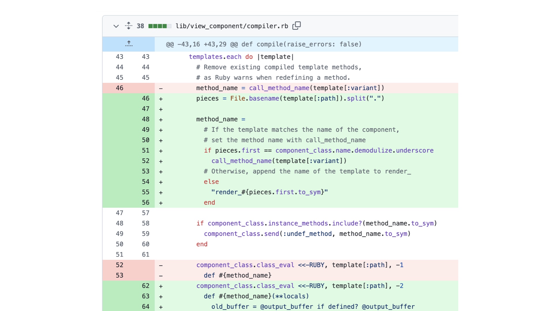
environment that is removed from the target medium (in our case, Figma), there is no guarantee that what is designed can be built with our components libraries, at least without compromises. I see an opportunity here for us to build our prototypes with our components instead of with Figma, as doing so would eliminate this gap. I believe we’re most successful when we allocate our complexity for where it’s most necessary. |
|
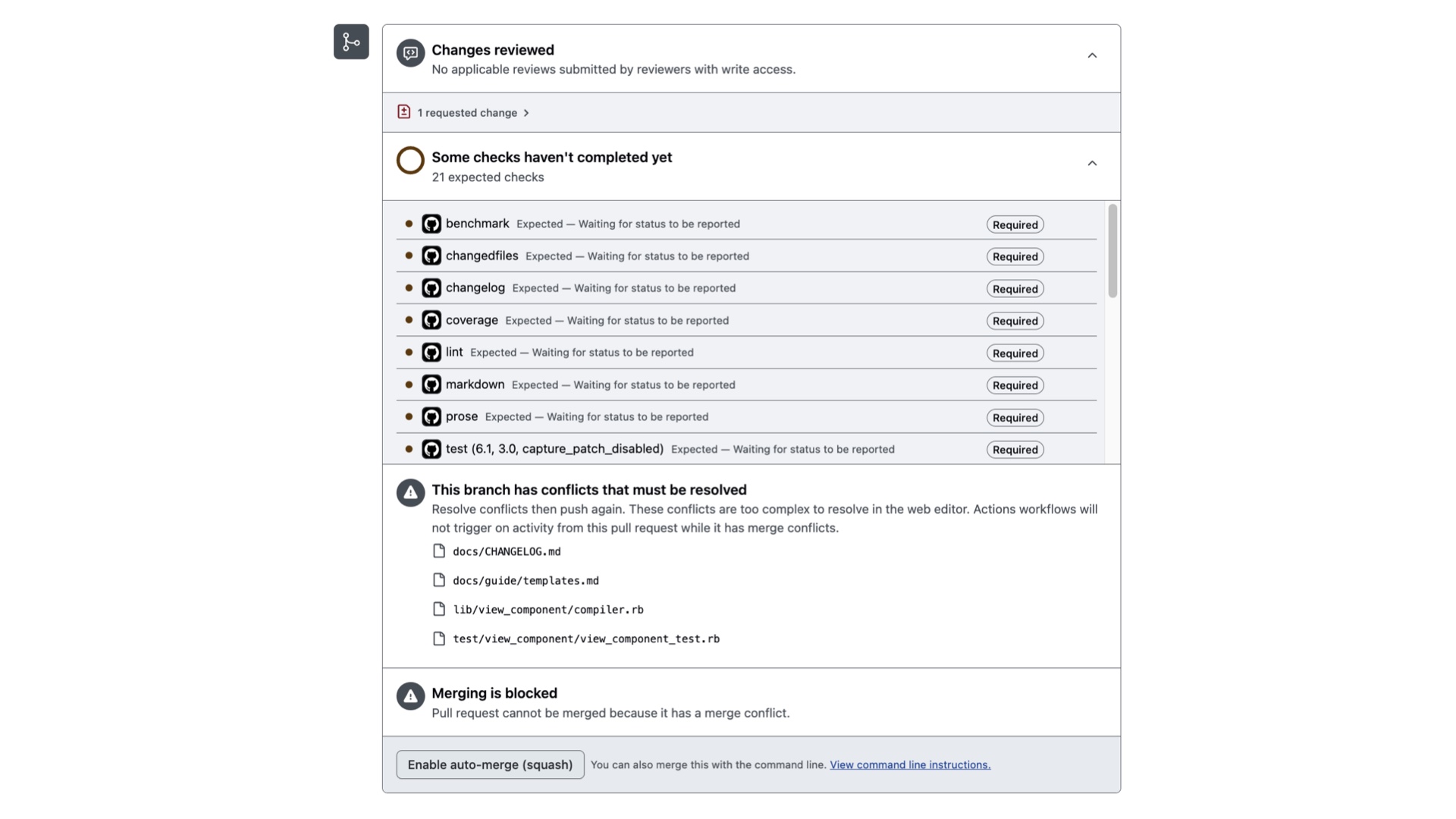
That might be things like diffs, four-dimensional drag-and-drop, |
|
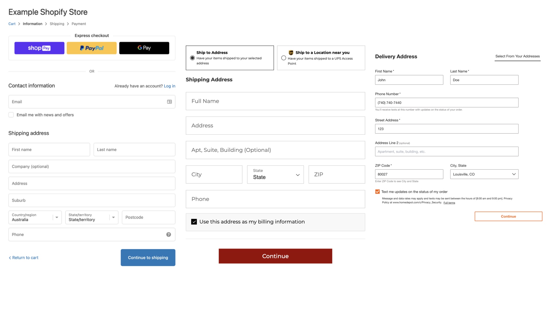
or the merge box. These unique kinds of UIs have less convention and unique accessibility characteristics that are expensive to solve. But a lot of the time, our budget should be zero. To build it with what we have already. To copy-paste. And I think our customers will prefer it! The people who use the software we build are likely interacting with dozens of other apps and a given day. Do we really want to expect people to relearn how to do the same thing differently every time they pick up a new app? Imagine if the car world worked this way. If every brand decided to put the accelerator in a different place. Let me give you an example: e-commerce checkouts. |
|
For the love of God, why is there more than one way for me to provide my shipping address on the internet? Thank goodness for Shopify’s impact in standardizing this experience for a significant portion of online shopping these days! I’ve had to fight with my inner artist to view everything as art, when really we’re building tools. Don’t get me wrong, art is a great medium for creativity! But this isn’t the place to prioritize it over usability. What’s exhausting to me about this problem is that things could not be more different on the backend: we regularly use and improve libraries that already exist, almost as a rule. |

|
As Rubyists I think we are really good about working together to improve open source software. Contributing changes back to Rails based on our experiences using it. The same should be true about UI frameworks and even browsers themselves. |
|
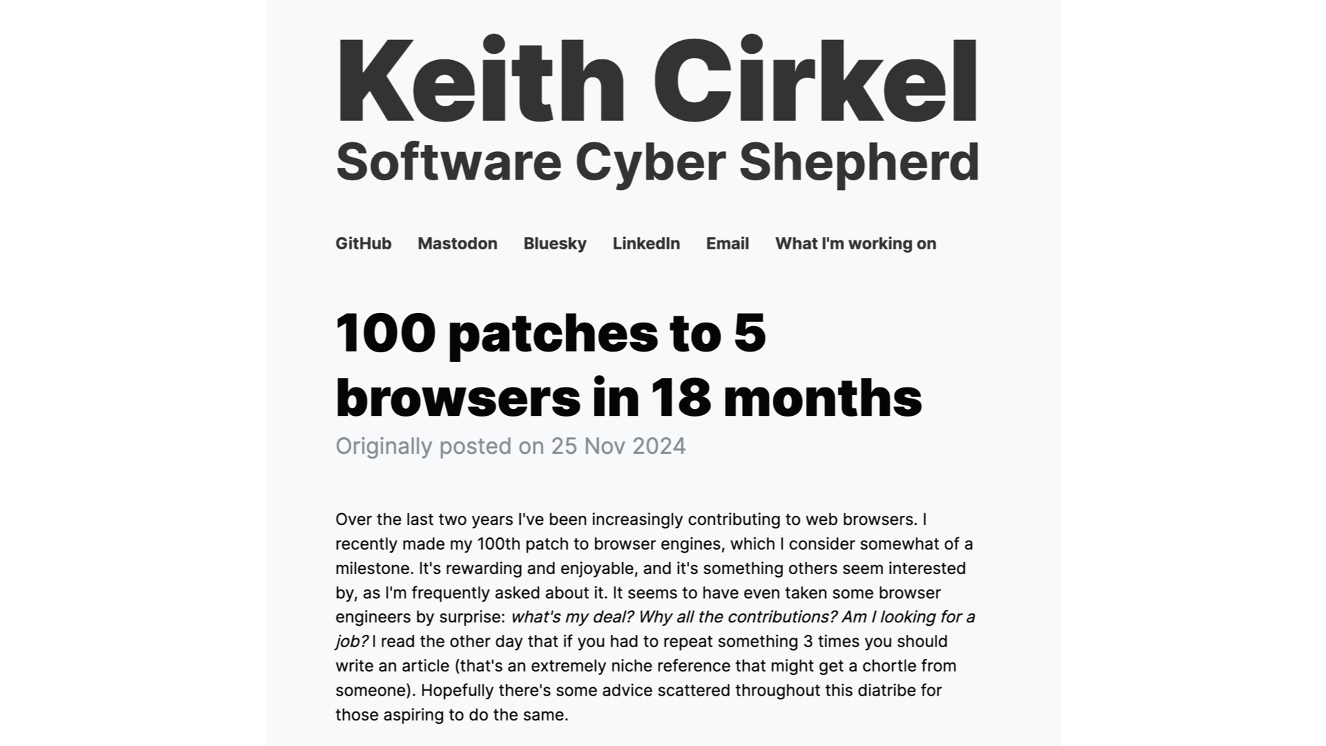
One of the most inspiring things for me as I've done this work is seeing my colleagues work to improve the greater ecosystem. For example, my colleague Keith has worked to improve browsers to the point of enabling us to remove custom behavior from our code base. In just the past 18 months, he has contributed 100 patches across five different browsers! https://www.keithcirkel.co.uk/100-patches-to-5-browsers-in-18-months/ |

|
I was recently asked by someone about whether their company should build their own design system from scratch. They had a single designer and a handful of engineers, at least an order of magnitude smaller than our team. Here’s what I told them: we can’t afford to maintain two implementations of our design system to our own standards. And even at our scale, we don't build all of our UI ourselves. For example, we use 3rd party charts (High charts) and tables (React Table). So what can you do? |

|
I’d recommend thinking about UI complexity as something to budget for. And then spend it wisely, only inventing as little as absolutely possible. Because if there’s any lesson I’ve learned in my time working on Github’s UI architecture, |

|
It’s that the equivalent amount of code complexity costs 10x as much on the frontend as on the backend in the long run. So in conclusion, |

|
Native is the new baseline. Consider how your app compares to your competition, especially their native app experience. |

|
The UI abstraction paradox is real. Beware the cost of reinventing the wheel and reuse existing design systems whenever possible. |

|
And frontend costs 10x backend, so budget for frontend complexity wisely. |

|
Thank you |